Letter bombed
Tim Fendley examines the world around him in the context of the typographic information that bombards our conscious and self-conscious states.
I remember, a long time ago, reading a technology supplement in the old “Direction” magazine which asked notable industry figures to predict their professional lives ten years on, in the year 2000. The pundits’ obvious response was, “digital tools in networked environments, mostly from home”.
Most striking was Brett Wickens’ contribution. Way ahead of his peers in his understanding of technology, he foresaw a time in the future when he would sit down with a sharpened pencil and a piece of paper and create ideas for clients. The issues facing our industry today are equally “challenging”.
We live in an increasingly digital world. The other morning, in the space of three hours I had looked at and garnered information from more than ten different “platforms”. Some were very obviously digital and about my person – my laptop computer, my Palm organiser and my mobile phone. Some were about my travels – the real-time information on London Underground’s Northern Line (it didn’t work), and others are now pseudo-digital, media-driven by digital methods, the newspaper I bought, including the printed receipt slip, and the bus timetable, which in London is dynamically printed for each stop, from a large database.
From what I read we are only going to get more technology. You’ve heard of wearables, intelligent fridges and vehicles that know where they are and will dial the RAC when you break down. In San Francisco they will even counsel you for the inevitable trauma caused by a flat tyre. The Western economy needs technology, so that’s what we are going to get, we will all have to work out a purpose for it later.
But we have been here before. When Gutenberg’s press was introduced in the 1430s some tried to ban its use for fear it would be made to print the word of the devil. But this wasn’t the end for printing. From having just type on the page, we had etched drawings, monotone pictures and then full colour. There have been more than 35 methods of producing a repeatable mark on paper invented, used, and in a collector’s cupboard somewhere.
Type has jumped from the printed page, been coloured, animated, downloaded, pixelated, you name it. Every typeface has been there, done that. We all like to communicate and type is the method to tell you when the train is arriving, when your next meeting is, who is calling, what the price of a holiday is – and to tell stories.
If content is king, then presentation is what makes it visible. It’s also no good making useful things look stupid. We don’t want all the messages thrown at us, we need ways to navigate, to make discerning choices. Objects, environments and media need signposting. We look for authority, for expression, for a connection to our lifestyle, to what we know.
The lack of attention to detail, to do something well, to take the chance to make us smile in our everyday lives when we use a product and a service, is a missed opportunity. We need more editors and curators who are interested in people, not just the companies they work for, or just the purity of their “art”.
If our love of storytelling hasn’t changed for eons, then what about the conventions and principals of typography? Are they relevant on these digital platforms? After all, they were developed and have evolved over the past 500 years. While the physiological and technical constraints have changed, our human perception remains the same.
The development of typography on paper was partly about a humanist approach, based on our perception. The letter “O” is often designed imperfectly round – even in Futura – because the eye is not a perfect sphere. We find it easier to read 35-55 characters a line so we don’t mistake the start of the next line.
It was also partly about pure style. Do we read serif type any better than sans serif? Brian Grimbly, designer of “Design”, then, in the mid-1960s, researched the subject fully and concluded his favourite Univers typeface was no less “legible” than any serif font. We read best what we read most.
The main point here is that in the era of paper and printing, any communication with words went through the hands, the eyes and the touch of a complete mix of people – authors, editors, designers, typesetters and compositors. Not so with our ubiquitous digital screen. All it takes is a programmer and a database, or an accountant with the PowerPoint software.
The great designer, Charles Eames, was once asked what shapes creativity in design. The constraints, he replied. Today, from the raw, but effective dot matrix real-time “Info” boards to the 152 by 126 pixel screen on my Nokia mobile phone, each platform has its own constraints and some new properties.
Interactive television is really awful. OK, I get the constraints, but the information doesn’t have to be so bland, the interaction so confusing and different at every turn. I am not solely interested in shopping. It could be so much better. There are principles for these kinds of things. A new mix of principles, from the disciplines of human computer interaction, to the application of scenario-planning. One thing did impress me. It knew my name and my postcode.
We are in early days – I did find looking up my bank account on the Web useful, but I have stopped using it already as it was far too “clunky” and difficult. Whatever happened to Wap technology? It should be a good system, it just didn’t do anything. As for PowerPoint, maybe things are changing. One large multinational corporation has just banned its use. All their managers were concentrating on making their presentations colourful, “wizzy” and “snazzy”, and not thinking about what they were actually saying. But business has only two colours – black and red.
Text messaging on our tiny digital screens may be a fad, used mostly by teenagers to flirt or swap exam results, but they are an example of our strong desire to relate with each other. My teenage nephew’s text messages mix pixel pictures with slang and massive editing with vowels removed. There is even a book about them already. New typographic ways are developing for these kinds of clipped messages through a quick, instant and personal medium. The English language is alive.
Not to be negative about these new digital platforms, if the constraints have yet to be fully pushed by clients and designers, then the new properties are just beginning to be explored. We are being experimented on by these technical evolutions, and the ones that are any good will stay with us. That’s why we still have the book, the magazine and printing. Many of us still turn the page as well as click. I would really like to have one address book – not one each on my laptop, my Palm and my mobile.
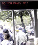
We also live in a time which eminent world watchers like Peter Drucker believe will be seen as the next major development of mankind. We have had the printed word, the steam engine and we are now leveraging the silicon chip. Our world will not be far off that of the film Blade Runner. Bus shelters will communicate with us, understanding whether we are Nike or Adidas folk, whether we wear Prada or Karen Millen. Messages will be tailored to the real person.
What will become important is that we recognise the need to communicate with a certain quality. Advertising products and lifestyles is one aspect, people also need meaning and understanding from their environments.
And we should provide a platform for the meaning. Well-designed messages, clear information, simple hierarchies and well designed, legible typography in messages – with a twist. It is our duty to put the smart into these new products.
-
Post a comment


