JKR creates soft look for One 2 One packs
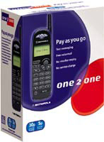
Jones Knowles Ritchie has created new packaging for One 2 One’s consolidated range of boxed mobile phone products, to boost sales in an increasingly competitive market.
The consultancy has softened One 2 One’s existing purple and red marque in a conscious move away from the hard, angular shapes associated with the telecommunications sector, adapting the imagery into circles for clarity. This is in response to One 2 One’s simplification of its product offering and the corresponding merger of its “more 2 say” and “up 2 you” packages into a single “pay as you go” scheme.
JKR partner Andy Knowles says that by minimising the front-of-pack information, One 2 One can communicate a focused, friendly offer.
The consultancy was appointed by One 2 One in May following a four-way credentials pitch, having worked on the brand’s original launch material in 1992. Knowles says JKR’s challenge was to “provide a consistent ‘brandface’ to the consumer and minimise confusion”.
-
Post a comment


