
Supple’s foxy identity for a coaching network “bucks the usual business clichés”
The branding for Fox Meets Owl plays off the perceived personalities of both animals.
Supple Studio has designed the identity for business coaching network Fox Meet Owl, featuring a logo with a hidden meaning.
The Bath-based studio worked with copywriter Jim Davies on the branding project, which rolls out primarily on Fox Meets Owl’s website and mobile site.

Founded by business coach Anna Lueneburger, the company provides a network of vetted coaches for clients. Lueneburger’s approach as a “marriage of creativity and science”, explains Supple founder Jamie Ellul.
“We felt that was a really interesting angle,” Ellul adds, and it also allowed the team to explore the possibility of bringing together the personalities of the fox and owl.
“Buck the usual business coaching clichés”
Pairing the animals for the company’s name was Davies’ idea, and was partly an attempt to “buck the usual business coaching clichés”. For Ellul the fox offers a “wily, cunning, energetic” aspect while the owl brings a wiser, 360 degree perspective. “I always think of the owl’s ability to turn its head all the way around,” he adds.
The two creatures also represent two different spheres, according to the designer; the fox hunting on the ground, and the owl watching from above.
While the animal theme is distinctive for the sector, the name had to be available online, which resulted in Fox Meets Owl, Ellul explains (Fox and Owl was already taken).
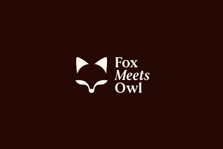
The logo incorporates both animals, creating an owl-shaped negative space between the fox’s whiskers and ears. The fox is clearer at first, which was intentional, according to the designer.
When the owl appears between the fox’s features, there’s a “moment of recognition” which reflects how the company’s advice can “bring a new perspective and shine a light on elements that were maybe already there”, Ellul says.
On the website, the logo can be animated so that his whiskers move, which aims to add “a bit of playfulness” to the identity. The design team initially also worked on a hybrid animal – a fox that had wings, Ellul explains – though opted for the more “muted” approach.

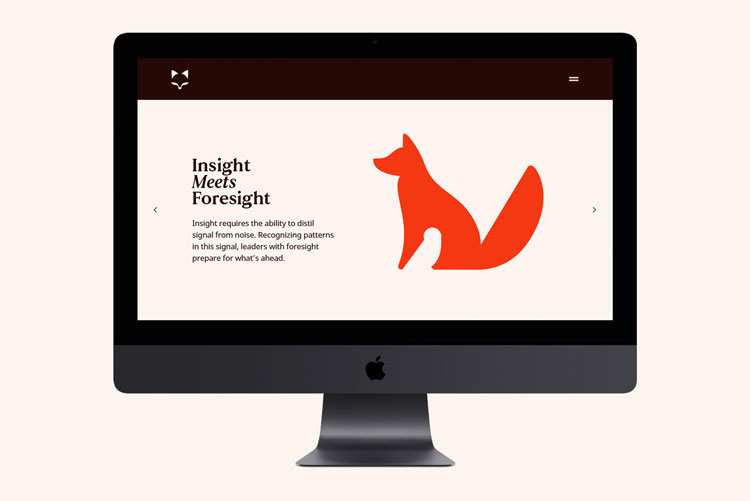
Supple has crafted illustrations for the rest of the identity, which combine the two animals – the owl appears as the white fur on the fox’s belly, and between the fox’s legs, for instance.
The colour palette takes inspiration from the fox, though Supple took some “artistic license” with the tone, Ellul says. The orange has been brightened so that it works better on digital applications, according to the designer.
Face37’s Bobby typeface has been used which “feels kind of bookish” but has a softness and quirk, Ellul explains. He adds: “The fox is the playful animal while the owl is more serious, and we wanted to get that into the typography.”
What do you think of the work for Fox Meets Owl? Let us know in the comments below.


This is my cup of tea. One of the best identity I have seen in 2021. I love the wit as well as the execution. It also shows that designers teaming up with copywriters create better work. Well done Jamie, Jim and the Supple team. I wish I would have done it myself.
Thanks Pierre, most kind. Always a joy working with Supple. Hope you’re doing well.
This is stunning this piece of work, the simplicity of the logo, the naming, the animations within the identity etc – everything is so so good. One of favourite pieces of work this year.