God is in the details
Omnific has redesigned the Common Worship prayer book with acute attention to detail. Quentin Newark shows due reverence
I used to design the insides of novels. It did not seem too complicated; choose a typeface, a size, a line length, the number of lines on each page. In fact, it’s pretty easy, but the more of it I did, the more I realised the difference that tiny changes make. Some designs were a lot easier to read than others that were almost the same. I learned that this kind of design is all about the finest and subtlest of judgements.
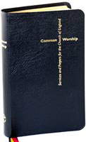
Derek Birdsall’s latest book design is one that only comes up for renewal every 20 years or so, the Church of England’s new service and prayer book: Common Worship. Today, he and fellow Omnific designer John Morgan will wait at Black Rod’s garden entrance before being ushered into the House of Lords for the book’s launch.
The project began when the chairman of Liturgical Publishing, the Lord Bishop of Guildford, established a design panel. This was to make the process of the design of the new prayer book professional and, indeed, possible, given the amount of time the General Synod takes to debate and decide some issues. The panel consists of a few selected churchmen and religious publishing experts. Christopher Frayling, rector of the Royal College of Art and now chairman of the Design Council, was invited to lead it.
A list of designers was drawn up, all thoughtful choices: Pentagram, presumably after Angus Hyland’s Bible-as-a-series-of-booklets covers; Phil Baines, probably for his background – he trained to be a Catholic priest; and Atelier Works. But it was Birdsall’s Omnific which pipped Graphic Thought Facility and Phil Cleaver, the other two on the final shortlist, for what Frayling described as Omnific’s “creativity married to precise process”.
Birdsall and Morgan’s involvement began in a way most designers only dream of. As they sat in the public gallery at a meeting of the General Synod, the Lord Bishop of Guildford announced the appointment of eminent typographic designers, and then pointed up to where they sat. They stood up, a little reluctantly, and 500 members of England’s clergy applauded.
Birdsall describes the prayer book’s typographic challenge: the italic when printed in red looked smaller than in black. His solution was to enlarge it by a tenth of a point. “You’d be amazedÔ he says, “it made a colossal difference.” He rifles among a pile of discarded proofs to find me the comparison.
In Birdsall’s pencil-sketch analysis of the job, you can see his elementary and precise approach to the text; picking the longest line, the longest prayer, and dealing with these first. He put forward a longer page than was first recommended, to allow less breaking of prayers: less rustling of pages turning during the middle of a prayer, less intrusion of the physical into the spiritual. This kind of understanding comes from 32 years of poetic typography for Ambit, the Arts Council-funded poetry journal.
Birdsall’s familiarity with poetry also led to a most unexpected decision: to range all the headings to the right. If all the headings had been on the left, the text would have read as one long stream. Birdsall says that ranging them right makes them a distinct “label” above the “cloud” of each prayer. “You can read and understand the structure of the page with your eye corners.”
The earliest research involved Morgan going to his local church and talking to the vicar. He learned that the most important thing for the priest’s version was to be able to hold a baby in one hand and read the book at arm’s length from the other.
The apparently strict needs of the layout presented very clear needs for the typeface; a clear distinction between regular and bold weights, a good-looking and clear italic, good numerals. And, in case it needs saying for any neo-Cranbrooks out there, easy to read. No preferences or guidelines were given by the Church, but Birdsall felt it ought to be an English typeface. As a type designer, the deeply religious Eric Gill was the obvious candidate.
After nearly 40 years of getting to know the character of certain typefaces, Birdsall already knew what his likely choices were; News Gothic and three of Gill’s, his Sans, Perpetua and Joanna. Univers, so clear and readable, was used to test the others against. It was not a serious contender – its designer, Adrian Frutiger, is Swiss, and the type has a cold, mechanical quality. “It hasn’t got any balls” Birdsall offers.
After a series of type tests, no serif was working, since so much of the text needs to be in bold, and every serif bold is disappointing – even Gill’s. (“Except Baskerville Bold” Birdsall adds, “which is a typeface in its own right.”) It was Gill Sans, with its “wonderful” italic, that was Birdsall’s clear favourite.
When he presented his first designs to the design panel, Birdsall felt very strongly that if they would not accept Gill Sans, he would not want to do the job. He thought round the possible exceptions to his choice. The supposed greater legibility of serif over sans was not important because there is not much continuous text. A sans is too modern, but Gill Sans has been in use for 70 years; it is firmly part of the tradition in its precedents and ancestry. Gill did not set out to rethink type in the way that Paul Renner did with Futura. The churchmen nodded, Birdsall felt it going his way. “That Gill,” one panel member muttered as they were leaving, “morals of an alley cat.”
For any typo-anoraks out there, the final text size is 9 on 12 point. This goes up to 11 point for the baby-at-arm’s-length edition. And it’s Gill Regular, not the Book.
The execution of the book itself has gone very smoothly – Omnific knows books. Wife Shirley Birdsall patiently typesets, Birdsall and Morgan finesse pages, daughter Elsa Birdsall calmly manages. There came a point when the lack of any suggested cover design began to raise questions. No images, no decorative fripperies. Birdsall started looking over Shirley’s shoulder as she typed out the title, and saw that the title consisted of two lines, and “Common” was nearly the same length as “Worship”. With some deft fiddling the title has become a cross.
The sense and sympathy for tradition in both Birdsall and his client is extraordinarily strong. The lectern editionà for public readings, will be scaled up, and the hymns will be shown with their music. Birdsall hates the fiddliness of musical notation and said so. John Harpner, from the Royal School of Church Music, who is overseeing the details of the music, told him it was a priest, Guido d’Arezzo, who had first developed musical notation from the alphabet.
So they have reverted to the original form. They are using plain Gill letters: for example, the lower case “g” instead of the bass clef derived from it. This kind of detail is at once idiosyncratic, fun-loving and inventive. And sobering to think that the client has such a firm grasp of typographic tradition going back a thousand years.
Another example of Birdsall’s playfulness are the endpapers. They are a very deep, dark purple, a colour you’d imagine derived from close study of ecclesiastical costume. Not so: Birdsall dined at his local Turkish restaurant the night before a production meeting. When the subject of the endpapers came up, he produced his paper napkin. Everyone agreed it was the perfect shade of purple, and Cambridge University Press was sent the napkin to match.
The most interesting part of this project is how fresh it seems – the fact that it is done only once every 20 years; the intelligence of the client and knowledge of its own typographic history; the meaning and implications of the content. I think it is sad that this is now so rare. It is this kind of job which began our profession; it used to be what we all did, and in a way, it is the reason graphic designers exist. Whether or not you “believe”, we would all benefit from the problem solving and the typographic exercises such projects would demand of us.
For now, though, it is Birdsall who is privileged to follow in William Caxton’s footsteps.
Quentin Newark is part of Atelier Works
Read this next

-
Post a comment


