May the best marque win
It’s no longer just the battle over London’s mayoralty – it’s the fight for the perfect electioneering logo. Damian Schogger examines each contender’s logo and investigates how it came to be
With the vote for London’s mayor now less than a month away, electioneering is hotting up in preparation for a climax on 4 May. But each of the five main protagonists is approaching the ballot with a very different attitude towards branding for their own campaign.
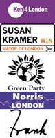
Liberal Democrat candidate Susan Kramer unveiled her logo last autumn, but aimed it at the mainstream press, as opposed to voters. Her mayoral campaign manager, Ashley Lumsden, who designed the identity, based it on City of Westminster road signs.
“We looked to create a logo to use as a corporate identity which would be clearly identified with her name and associated with London,” says Lumsden. “The problem was that the red colouring suggested she was a Labour candidate, so we lightened it. It is quite relaxed in terms of the party identity, featuring a small bird, and it includes a lot of white space which creates quite a calm and reassuring feel.”
Defending the decision not to push the logo into the mainstream public arena, Lumsden explains: “It is aimed at journalists, who will see it on press releases and other communications material. It is not to win votes. We would rather the electorate saw policy statements and photographs of Susan.”
Kramer has put creativity high on her agenda. “It often sets London apart from other European cities, but the current funding is preventing people from being creative. Community banks will provide help and finance,” she says in her manifesto.
As the official Labour Party candidate, Frank Dobson is using the party logo as the basis of his campaign identity, in association with his signature, Frank.
“The Labour logo shows which party Frank is representing, while his signature sums up that he is Frank Dobson,” explains Dobson’s campaign spokesman Rob Yeldham. “It relates to the individual aspect of the election – his name is his word,” he adds.
But Yeldham dismisses suggestions that the Labour candidate’s decision to use his signature as a logo, instead of creating a fresh corporate identity, reflects an indifferent attitude towards design and creativity.
“Culture is a very important part of the economy and the promotion of good design, communications, the arts and leisure are part of Frank’s economic and cultural strategy,” says Yeldham. “There is a huge amount of talent and design schools which are an incredibly important area of London.”
In his manifesto, Dobson refers specifically to the creative industries, describing the capital as “one of the most important centres of arts and culture in the world. The city benefits culturally from its wealth of theatres, museums, galleries and other arts centres.”
Highlighting the fact that London’s creative economy is growing twice as fast as the rest of the economy, Dobson adds: “Increasingly the cultural and creative industries are central to London’s success and will be particularly vital in the next decade, where they offer real prospects for new jobs. The quality of culture offered in London makes it the gateway to the UK for tourists and is important in sustaining London as a competitive commercial centre.”
With former Channel 4 creative director Ceri Evans being the strategist and co-director for Steven Norris’ campaign for mayor, the Conservative candidate’s election trail has had a strong creative slant.
But Evans maintains that Norris has always taken a keen interest in all aspects of design anyway. “Steven likes the idea of big projects and that design has to be redoubtable. He is passionate about spatial development and all the things that enhance the quality of an environment, including architecture, interior design and their ergonomics.”
“I will support the Arts in London. But not as a luxury, rather as one of the integral commercial success stories of our city,” adds Norris in his manifesto.
The colour scheme for Norris’ campaign and identity was originally purple, though it was subsequently changed to blue “for party reasons”, according to Evans. The slogan “action not politics” has also been adopted.
“We did not recruit a design consultancy, but commissioned a freelance designer,” says Evans, declining to name the designer in question. “We put the design focus groups alongside the advertising and policy-making, opting for a simple, clear and straightforward logo.”
With the London Green Party focusing more on issues than the personalities involved, its candidate, Darren Johnson, has adopted a slogan for his campaign while also using the Party’s standard logo.
“We are using the slogan ‘a strong green voice for London’, but are letting the policies speak for themselves. Our three main areas are greening the transport, economy and environment. We are keen to see a massive amount of recycling and greater use of natural resources,” says a London Green Party spokeswoman.
Unlike the other main protagonists in the election, independent candidate and current favourite Ken Livingstone had fewer party restrictions on his campaign identity, which was created by the in-house design team at advertising agency Euro RSCG.
Euro RSCG head of design Mark Cakebread, who developed the logo with head of art Andy McKay and creative director Mark Wnek, says the brief was to produce a “down-to-earth, modern, for-the-people sort of look”.
“Because Ken is running as an independent, we could start from scratch and pretty much do what we wanted. The logo, which is used on all communications material from posters to press releases, had to be incorporated into the badge, so the ‘Ken’ part is the badge element,” according to Cakebread. “The purple is in line with his appeal to younger voters and says everything about Ken Livingstone – strong, modern, friendly and powerful.”
Having spoken to the candidates, Design Council chief executive Andrew Summers is optimistic about the future of design in London, but says that the issue of transport is a “key aspect”.
“Transport and the design of the London transport system are high on the candidates’ agendas, which we would strongly advocate. It is vital for London in terms of the economy and quality of life for Londoners. The lead must be taken from the Jubilee Line extension, which is a very good model and has been a real eye-opener to how a transport system can be developed,” says Summers.
“From what I’ve heard and from talking to them, all the candidates profess the importance of the environment of London and encouraging innovative thinking, which we obviously support. London already has a strong reputation for design. A good administration can enhance it, but it is not dependent on it.”
Read this next

-
Post a comment


