App it up
Publishers already worried about online font legibility now have the very particular demands of the increasingly ubiquitous iPad to agonise over too. Emily Pacey talks to graphic designers about getting in on the app action

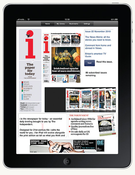
As books and magazines migrate online and on to smartphones and tablet apps, graphic designers are tackling the needs of people reading on mobile – and sometimes very high-resolution – screens.
‘Users want a much deeper experience on the iPad, and the expectations for design display and beauty are much bigger compared with online,’ says Cogapp design director Colin Jenkinson. Cogapp recently created a travel guide app for book publisher Dorling Kindersley, for which it conducted detailed research into the way that people read apps (News, DW 2 December 2010). ‘People tend to think that you can just pour text straight from print into these devices, because tablets feel physically quite close to printed matter such as books, but there is, in fact, lots of work to be done on typography to get it to the right state,’ says Jenkinson.
In its research, the consultancy found that reading on an iPad works differently than it does in print, with wrapping text and multiple columns creating a confusing flow of content. It found that single columns of vertical scrolling text work best. Jenkinson is a particular fan of the typography used in book publisher Phaidon’s 2010 app, designed in-house.
‘As the graphic designer, you need to break the text up and put it under drop-down bars and sliding tabs, rather than having flowing copy,’ says Stream Publishing creative director Lee Penton. Stream has just created retailer Spar’s first online magazine, and is hoping to create an app next year. Penton recommends ‘abstracting copy into six or seven elements to house feature sections in their own vehicles’.
The aesthetic expectations of iPad users tend to be higher than those of online users – partly because they are paying more for their reading material, and also because of the higher-quality visual experience an app can offer.
The iPhone’s Retina display offers four times as many pixels per square centimetre as a computer screen, meaning that even delicate serif fonts degrade when translated. ‘Consider scaling up,’ recommends Jenkinson.
Some good advice is to preview the typography on the devices as early in the design process as possible – and as often as possible. Cogapp has developed a tool that allows the consultancy to render and change fonts live on an iPad rather than going back and forth between desktop and iPad. ‘Type just looks so different on those devices – it looks slightly condensed,’ says Jenkinson. Essentially, you need less text on the page for an app, but higher-quality rendering. Both an opportunity and a potential pitfall for designers comes in the form of the iPad’s huge range of embedded fonts compared with those available to Web designers. This means that designers can potentially go wild, but caution must still be exercised and classic rules of design applied, says Jenkinson.
Another consideration if you are wanting to ski off-piste and embed fonts not available on the iPhone, iPad or on other tablets is font licensing. ‘It is really early days for font foundries at the moment, in terms of the iPad,’ says Jenkinson. ‘When you embed a font in an app you need to ask the foundry what the charges are. They weren’t ready for us on the DK job and had to make up the fee structure for the iPad licensing model on the back of an envelope, there and then.’ He recommends that you establish a ‘very open and communicative’ relationship with anyone whose fonts you want to use.
Some new services tailored to the needs of online graphic designers include Fontdeck, which was set up by digital consultancy Clearleft. It allows designers to use typefaces that are optimised for the Web and mobile devices. ‘Not many foundries sell Web-optimised fonts yet. Fontdeck has the latest version of fonts and we also host the font files for designers,’ says Fontdeck creator Richard Rutter.
Other ways to create a high-quality user experience which resembles that of reading printed material include tricks like page-turning, textures and bevels. This is particularly suited to the iPad, which simulates the actual size of magazines. But not everyone agrees.
‘In a way, online and app-based magazines should not look like a hard-copy version of the printed page, as you are then not using the medium progressively or with integrity,’ says Penton. The phenomenon is reminiscent of the development of the car, early models of which strongly resembled horse-drawn carriages. On the other hand, summing up both sides of the debate, Penton says, ‘If a textured background fitted the feature, I wouldn’t really have a problem with it.’
It’s early days for online and app-based text, and exciting times as typographers and designers find their feet with these relatively new technologies.
-
Post a comment


