Don’t bank on new fiver, its layout is not of note
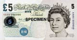
Isn’t it time the British graphics industry did a ram-raid on the Royal Mint? The new fivers, with their sad layout and lettering, again wouldn’t pass any grade in a primary test of decent design.
Currency notes actually get design, good or bad, to reach everybody everywhere all the time.
So how money looks and how it demonstrates a country’s commitment to its designers, and design itself, is of prime importance.
Is it all a ploy to make us give up sterling? Either way, poor old Elizabeth Fry [the prison reformer], as well as Britain’s spenders, deserve better. Start the engine.
Brian Angel
Angelface
London W8
Start the discussionStart the discussion
-
Post a comment


