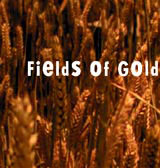
Interfield makes a drama out of title sequences for BBC’s Fields of Gold

Interfield has designed title sequences for BBC1 drama Fields of Gold, a two-part GM crop thriller starring Anna Friel and Max Beasley to be transmitted this weekend, 8-9 June.
The work features an animated typeface created and art directed by Interfield joint director Peter Anderson and animated by designer Chris Pearson. Eight individual typefaces or alphabets were drawn and then animated to create 26 small movies, which were subsequently typeset to create the letters required, Anderson says.
He adds, ‘The letter form literally grows out of an image of DNA coding and then breaks down leaving a trace of the coding behind. [Elements of] the eight individual typefaces were used in combination to create the animated typeface.’
Once in place, this system allows for easy changes without the usual complication of reanimation, says Anderson. It also helped to enable the design to handle the large amount of title information that needed to be shown in the Fields of Gold sequence.
The consultancy is now aiming to create a ‘suite of animated typefaces for the screen’ that can be treated as a toolkit for designing multimedia fonts and a library resource for future projects.
-
Post a comment


