Chaos Design ties Asthma UK knot
Registered charity National Asthma Campaign this week relaunches as Asthma UK, in a bid to raise its profile and position itself as the UK’s leading authority on the condition.
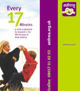
Surrey branding group Chaos Design is responsible for the new-look identity, which encompasses a revamped logo, visual look and feel, and creative strategy.
National Asthma Campaign trustee John Griffiths says the rebrand comes as the charity acknowledges that it needs a higher profile to compete in an ‘increasingly competitive charity world’.
‘We wanted to raise our public image and impact and convey the two elements of what we do: our research and our care and information services for asthma sufferers,’ he explains.
Chaos creative director Peter Campbell says a new ‘knot’ identity aims to show the charity’s key brand attributes of dedication, visibility, accessibility and authority.
‘It communicates feelings of constriction and tightness, but it’s a loose knot, which hints that there is a solution. The knot can be unravelled, and health and well-being are at hand,’ Campbell explains. ‘Graphically, it also hints at the idea of, “Don’t forget about us”.’
Applications include literature, posters, exhibition displays, office interiors, advertising and a website, www.asthma.org.uk. The work is also rolling out across a range of items such as volunteer T-shirts, flags and ribbons.
Chaos Design beat three other groups to the project, which is worth a six-figure fee to the consultancy, following an unpaid, creative pitch in December.
National Asthma Campaign’s relaunch coincides with World Asthma Day on 4 May.
Read this next


I want a design of litrature