Dragon gets teeth into healthy brands for kids
Healthy, ‘adult’ food brands could broaden their reach if their packaging was more child-led, according to a report released this week by Dragon.
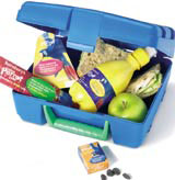
Parents, concerned about rising rates of obesity, are keen to introduce children to healthy products. But they are too often let down by ‘wholesome, dull packaging’ in ‘uninspiring formats’, says the report.
‘Nutritional foods tend to come in plain packaging that [emphasises] their naturalness,’ says Dragon senior brand consultant Nicky Owen. ‘That just isn’t interesting for kids. They love interactive packaging that they can tip, mix, squeeze, play and build with.’
She says healthy, adult-oriented brands would make greater inroads into the youth market if they adopted the design cues and formats of ‘junk-food brands’. ‘Both kids and parents responded really well when we mocked up [child-friendly] packaging for brands like Hovis and Ryvita.
‘Parents knew the products weren’t compromised, even if they came in fun packaging. And kids thought they looked more interesting. There’s definitely a gap in the market,’ she adds.
Parker Williams creative director Tamara Williams agrees that health-led foods’ packaging must become ‘livelier and more dynamic’ if the brands are to appeal to children.
The group revamped Cirio Del Monte’s Fruitini children’s range earlier this year and updated Sainsbury’s Blue Parrot Café children’s meals and snacks with a more ‘fun and funky feel’.
But Williams emphasises that brands can’t simply ‘slap graphics’ on to their products to reposition themselves for children. Size and format – for example, child-sized portions – are equally important.
Williams says she would like to see other, more nutritional brands tweaking their offerings for children.
‘Del Monte reformulated fruit so it is softer for a child’s palate. Ryvita could also do something with its physical product, like introduce mini-bread sticks. [On-pack] graphics could then support it, making the product more ownable for kids,’ she explains.
Ztwo Design designer Tony Guttman says the way forward is to give nutritional, adult brands a more ‘cheeky, humorous’ feel. The group recently created packaging for Fabulous Bakin’ Boys range of flapjacks and muffin fingers.
‘Kids love colourful, jumpy, jokey packaging that appeals to their sense of make-believe and seems to make an item into something it isn’t,’ says Guttman.
But packaging cannot be too ‘tacky’ or ‘childlike’. ‘Ultimately, Mum and Dad go into supermarkets and choose what kids eat, so it’s important not to go too far,’ he explains.
‘They are the gatekeepers,’ Williams agrees. ‘Though packaging has got to appeal to kids, it also has to [entice] Mum and Dad, who are buying for the whole family.’ Reassurance is ‘big’ for them, she adds – making it unlikely that clear, easily spotted nutritional information will ever go out of style.
The report comes amid a flurry of concern about children’s widening waistbands. Labour MP Debra Shipley is poised to reintroduce a Bill to restrict junk-food advertising to children this week, following a Food Standards Authority study suggesting a link between advertising and obesity.
Childhood obesity has more than doubled over the past 20 years, and nearly one in ten six-year-olds is now seriously overweight, the Health Development Agency announced last month.
-
Post a comment


