By the book

Next week, the winner of the Man Booker Prize for fiction will be announced – but will the book’s jacket designs be worthy of their contents? Angus Hyland talks to John Stones about judging books by their covers
Overall, the six nominated books conform to expectation. The potential Booker winner is a genre in itself, and the publishers are very much aware of its significance. All the covers have indistinct images suggestive of depth, which, together with the predominantly open serif typography, unambiguously advertise the fact that these books are serious reads and have ambitions to win prizes.
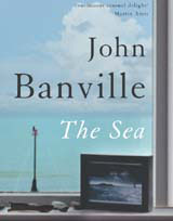
From a graphic design perspective, only two stand out – Zadie Smith’s On Beauty and Julian Barnes’ Arthur & George. The cover of Arthur & George is a pastiche, which matches the contents – an historical novel set in the 19th century. But, out of all of them, On Beauty is the most fully integrated design – it’s the most charming, interesting and successful as a package. Ali Smith’s The Accidental (designed around a photograph of a multimedia work of art by Derek Jarman) stands slightly above the other three (A Long, Long Way, by Sebastian Barry, Never Let Me Go, by Kazuo Ishiguro, and The Sea by John Banville). They are not terrible – they are merely standard, competent fare that do their job and nothing else.
All of the covers are quite conservative and deliberate in the way they market their contents. None of them are beautifully resolved typographically. The six covers have the look of designs that have been overseen by many different people – which is understandable when you consider the commercial importance of a potential Booker winner to a publisher. But, in an age when publishers are facing challenges (for instance, from different media sources), and when they should be looking at creating books that are successful and appealing objects in their own right, these six are disappointing. Only the use of blocking, on Arthur & George, and the end-papers, for On Beauty, make any real attempt at using design, or at satisfying the fetishistic pleasures that can accompany the purchase of a new book.
You can quickly judge a book by its cover, and it will always disturb the contents by providing a visual hook. I should add that I would not buy a book because of its design, but because of its author, or because of the publicity that has grown around it. So perhaps the publishers are right to be focusing on other things.
Judging the covers on their own is difficult, because the cover designs of books are conceived as part of a much wider marketing strategy. Also, in publishing, it’s the author that is really the brand, not the publisher. Only Faber has its logo on the covers, but I suspect that is a continuation of an earlier tradition.
It should also be remembered that books are self-selling and, unlike other packaged goods, such as soap, they are not disposable – you retain the book after reading it and keep it on a shelf.
The publishers are clearly not spending enough money on cover design. If I was to spend the £17.99 or so needed, I would want an object that was a little more desirable and higher in quality, particularly in terms of its physical elements, such as the binding and paper stocks used. It’s a nettle publishers have yet to grasp. •
Angus Hyland is a partner at Pentagram and consultant art director to Lawrence King Publishing.
Read this next

-
Post a comment


