Branding a worthy cause
Identities must satisfy diverse interests, but designers branding non-commercial clients walk a tightrope trying to convey the message, says Clare Dowdy
When it comes to communications, commercial clients have a host of audiences to address these days. From shareholders and analysts to staff, suppliers and customers, each has specific expectations of the organisation.
That may sound challenging enough for brand consultants, but in terms of target audiences, the non-commercial world is a minefield. Designers with experience of the charity sector and Government campaigns know how sensitive their different audience groups can be, and how their relationship with the organisation may differ. From Aids victims and alcoholics to the illiterate and mentally ill, all have particular issues about how they are portrayed through their support organisations. Happy Tomorrow has just experienced this with its work for the Government’s adult literacy campaign, Get On (DW 30 August).
The obvious difference between commercial and non-commercial branding is the customer relationship. While one organisation may be offering a product or service for sale, the other promises some form of free support. This support may be during a very distressing time, like the circumstances that Victim Support deals with, or to help sufferers of an illness or condition, in the way that cerebral palsy charity Scope does.
It’s up to designers to make sure that communications are neither patronising, threatening nor misrepresentational. In the annual report for Victim Support, The Grand Design tackled this pictorially. The aim is to get across the need for the service and the importance of the work it carries out. With a conventional client, this would be shown through case studies, but often victims don’t want to be identified. And anyway, people who are technically victims don’t want to be portrayed that way because of the stigma this tag carries, says The Grand Design’s creative director Paul Houlton.
Instead, the report, out in November, carries specially shot images, intended to show the emotional or physical state of victims of crime and abuse. The images show models carrying photographs that are intended as metaphors for what they have suffered.
But even this had to be handled carefully. One of the photos, of an apple and a knife, was deemed too violent by members of the client team. ‘They had read the metaphor too closely,’ says Houlton.
How far a design can go is often sweated out in focus groups with the organisations’ clients or customers. In the case of Spencer Landor’s identity for Muscular Dystrophy, sufferers explained that living with the disease was tough, so aspirational imagery would have been totally inappropriate. ‘But we could only create an in-your-face identity because it was what people with the condition were saying,’ says Spencer Landor creative partner John Spencer.
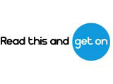
Happy Tomorrow is better known for its identity work with The Chemical Brothers than governmental organisations. This time, though, rather than going on gut feeling, the consultancy carefully researched what sort of graphics and typefac
e would be best received by Get On’s target audience. It meant choosing bold, simple imagery that didn’t smack of the Early Learning Centre, says Mark Bown art director at Happy Tomorrow. Originally, Bown came up with a graphic device like a bracket on its side to sit under the On, and give the impression that the ‘N’ was winking. However, this device was ditched when he discovered that the same symbol is used to teach dyslexics how to read individual words.
Happy Tomorrow also created a font for all the support literature that it is developing for the campaign. Get On is based on the simple letters that you draw when you learn to read.
However, like any organisation, charities and governmental campaigns have more than one audience. And as the charity sector becomes more commercial, these other audiences are carrying more and more weight. But these groups are likely to have a different relationship to the organisation than they would have to a phone company or a car manufacturer.
The donors or funders generally take two shapes – members of the public and corporate or governmental. So the message going out must get their attention and make them dip into their pockets.
The founders may well still be involved in the organisation and could have strong views about any changes in perception. It is what Media Trust UK manager Jo Scott calls ‘founders’ syndrome’. The trust pairs up design groups with charities that want help with positioning and communications. ‘A lot of these stakeholders have very strong emotional ties,’ she says.
But, according to Interbrand group deputy chairman Tom Blackett, there’s one audience group whose opinion carries even more weight than the customers: the staff. In a charity these are likely to be voluntary workers, who are mostly ‘fiercely proud and conservative’. When Interbrand rebranded The Spastics Society to Scope, ‘we had to do a huge amount of consultation with staff,’ he says.
The fact that the new name included the initials of the charity’s original raison’être, cerebral palsy, helped win over some of the workers, but still, ‘inevitably there was a certain amount of resistance,’ admits Blackett.
While sensitivities continue abound in charity branding, only the extra-cautious designer will avoid upset en route to a new name, identity or annual report.
-
Post a comment


