Key ingredient
Graphics are now essential for shops and restaurants that want to give customers an ‘experience’ that is good enough to ensure a repeat visit.
Do you remember when restaurants used to be all about the food and stores used to be all about the product? How naive it all seems now. These days shoppers and diners need to be entertained, titillated and generally manipulated into having a good time and returning. Graphic design is one, increasingly important element in the armoury used to achieve these aims and it is now being used in conjunction with interiors to strengthen the message.
Take Yo! Sushi, for example. Would it have been quite the media darling and subsequent runaway success that it has proved to be without that immediately recognisable bright and curvy graphic? Graham Sturt designed the original identity and is now design director at Large Design, which recently refreshed and expanded the brand as it begins to explore new areas both geographically (an outlet is opening in Edinburgh) and conceptually.
North Design also took an entertaining approach with the graphics for Thai restaurant Busaba Eathai. North partner Sean Perkins says, ‘For this kind of restaurant graphic expression is integral; people are [now] more informed and sophisticated. When it is done well it can help keep a restaurant alive. We approached the job as a series branding exercise and considered things like personality, attitude and how it will feel in five years time.’
It obviously works, as Busaba was getting 300 menus stolen every week. North has since created postcards and chopstick holders that fans can legitimately take away with them. The next Busaba will open in January 2002 in London’s Store Street with the same logo, but evolved implementation, colours and uniforms. ‘It was important that it wasn’t seen as the “son of” the first one, but an individual space in its own right,’ says Perkins.
However, it’s not just the cheap and cheerful chains that are getting the full graphic treatment. North also worked on Hakkasan, Alan Yau’s (owner of Wagamama and Busaba) upmarket Chinese restaurant and its evening lounge version Ling Ling. ‘It is an amazing concept. The interior was designed by Christian Liaigre and it has superb chefs, so the graphics had a benchmark to live up to,’ explains Perkins. Hakkasan is a sophisticated, sensuous establishment, which is reflected in the graphics. The designers took the logo, evolved it into a pattern, then into a textured textile for the menus and even the walls.
With his new contemporary Chinese restaurant in London’s Chelsea, Mao Tai, Mark Barnett used an artist rather than a design consultancy to produce its corporate identity, taking the link from interiors to graphics one step further. When Barnett saw Jacqueline Mulvaney’s collages, he commissioned her to create some artwork for his first Mao Tai restaurant in west London’s Parsons Green. ‘When we remodelled and expanded three years ago, she provided the identity throughout the whole space, which then evolved into the corporate identity in the menus and artwork,’ he explains. ‘We had a successful restaurant with disparate elements and wanted to tie it all together. Then with the new restaurant it was important to have continuity [so people] know it is related.’
For the new Chelsea restaurant, Mulvaney used a similar style of work to the original pieces, which were inspired by Soho’s Chinatown and featured installation boxes full of collages, calligraphy, newspaper cuttings and humorous messages. The new restaurant brings in memorabilia from Chinese gambling, including Chinese dice and playing cards.
To create the artworks, Mulvaney cleared the shelves of her local Chinese supermarket in Manchester’s Chinatown of ‘interesting-looking stuff’, arranged and re-arranged the objects on boards, then drew and painted layers on top. ‘In one way it’s all about luck and chance, but in another it’s a precise process [that is] as much about the negative space around the objects as the objects themselves,’ says Mulvaney.
Mulvaney sees the value of design consultancies, but says, ‘They can sometimes have a corporate feel, beautiful, but with no personality. By hiring someone with art training you get a unique, more quirky personality as you’ll never get the same thing reproduced.’ Barnett agrees, ‘Mulvaney’s work has evolved. People feel the connection and know it’s the same family, but you don’t get that in your face branding,’ he says.
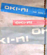
And it’s not confined to restaurants. Oki-ni is a new company introducing a new way of shopping that dispenses with the usual traditions of cash tills and taking the product away with you. Instead, you try products on in-store, order and input credit card details on-line and then the product is delivered. Fuel worked on the graphic identity and oversaw the design of the stores to ensure continuity with the look and feel of the website. Fuel director Stephen Sorrell says, ‘It was particularly important that the store environment was closely reflected in the website, because the website is where the transaction is made and that may be done while you are in the store or at home. The process should feel smooth and homogeneous.’
The clean, organic, minimal feel in the Oki-ni store, with its use of soft industrial textures and Japanese styling is clearly reflected on the website. ‘Subtle tones and natural materials are not common on the Web,’ says Sorrell. ‘But we have used natural textures such as wood and felt to link with the store’s environment and notepaper from exercise books, an old French receipt and faded newsprint. The photography is done in a simple, snapshot style and the site feels honest with no frills, while the quality of the design gives you a confidence in the brand.’
-
Post a comment


