Pentagram gives Poetry Foundation “ever-changing” visual identity
The new branding has been designed by Pentagram partner Michael Bierut, and features an “always evolving” logo that takes on multiple typefaces to show the versatility of poetry.

A Pentagram New York team led by Michael Bierut have designed a new, typography-based visual identity for US-based organisation The Poetry Foundation.
The organisation, based in Chicago, is a literary group and publisher that looks to raise awareness of the art of poetry.
It was founded in 2003, and formed out of Poetry magazine, which was first printed in 1912 and is still running today.
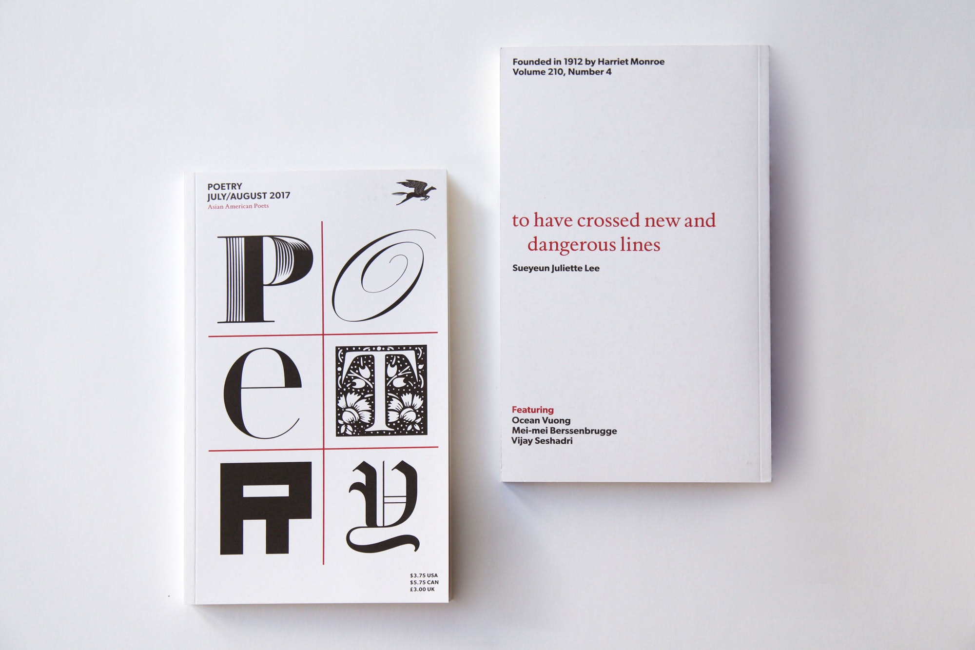
Bierut’s work for the organisation includes a new brand identity and a refreshed print design for Poetry magazine, which uses different typefaces and changing styles for the logo and magazine covers.

The identity consists of the word “poetry” split up into a two letter structure across three rows. This standard form then takes on different typographic forms, to appear both “formal and informal, conventional and radical, bold and delicate”, according to Bierut.
The aim is to create a visual identity and cover design that is “ever-changing”, to represent the “endless variations” that can be found in poetry, and how it is “always evolving and new”, adds Bierut; for example, different types of poem such as haikus, limericks and sonnets have varying verse structures that mean words are displayed on a page in different ways.
There is “no limit” to the number of typefaces and styles that will be used across the brand identity, says Bierut. The Pentagram team have currently designed five years’ worth of magazine covers for upcoming issues.

The identity also harps back to old, 20th century front covers of Poetry Magazine, which lacked imagery and were solely typographic.

Bold, sans-serif typeface Gibson is used as a consistent typeface for the logo and across headlines in print communications, with words split up to mimic lines of verse in a poem. Pietro is used for body copy.
“The previous typeface used was Gill Sans,” says Bierut. “We wanted something with the same weight and general colour, but a little more direct and uninflected. Breaking words into lines is meant to gently evoke the line breaks that give poetry its distinctive character as a form of language.”
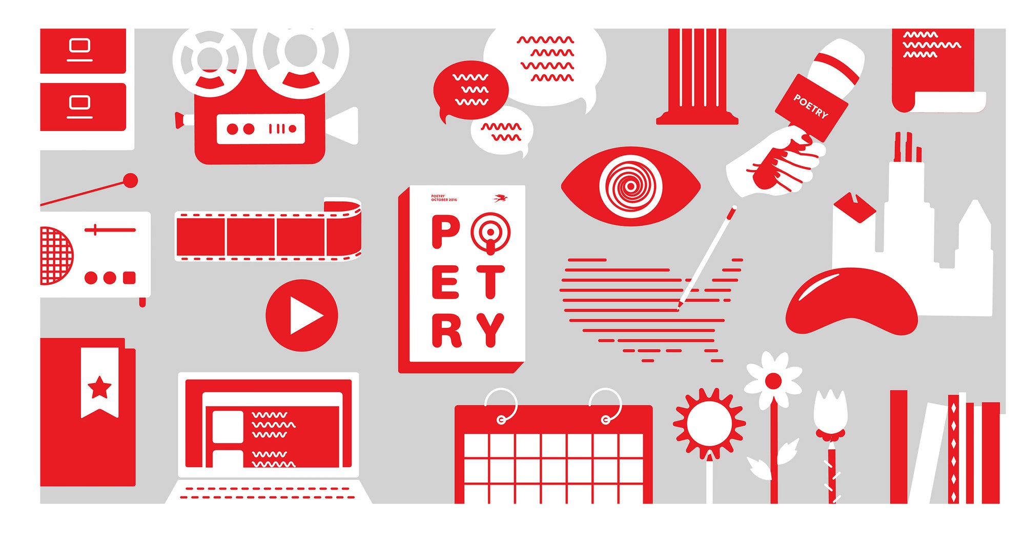
The new visual identity is currently rolling out online, across print materials and merchandise, and magazine covers. Studio Fuzzy Math has also designed a new website for the organisation.


-
Post a comment


