Peter and Paul create typographic identity for Noiascape
The new home rental company looks to have a strong “verbal identity” as well as a visual one, focusing on bold, abstract typography.

Sheffield-based consultancy Peter and Paul has designed the visual identity for a new, urban rental brand called Noiascape.
The name of the new brand is based on the Ancient Greek word “noia”, which means new thinking, and “scape”, which means spaces or communities.
Peter and Paul’s branding for Noiascape aims to be “strong” and “unique”, says the consultancy, to differentiate it from other rental companies.
“Verbal identity”
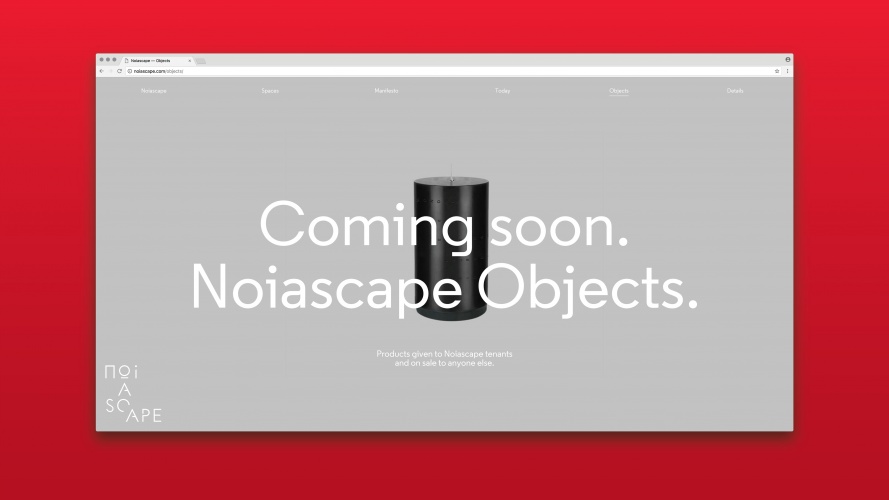
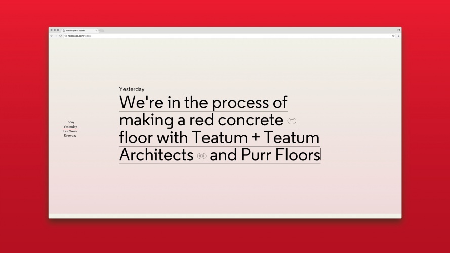
The logo incorporates a strong typographic style in order to give it a “verbal identity”, says Peter and Paul, with angular, fragmented lettering that appears in black set against a cream background. A secondary colour palette of red and grey have also been incorporated.
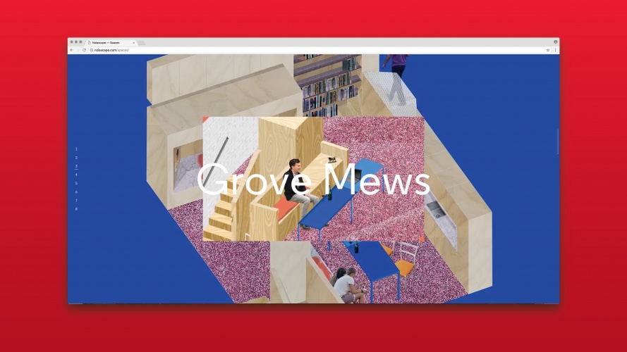
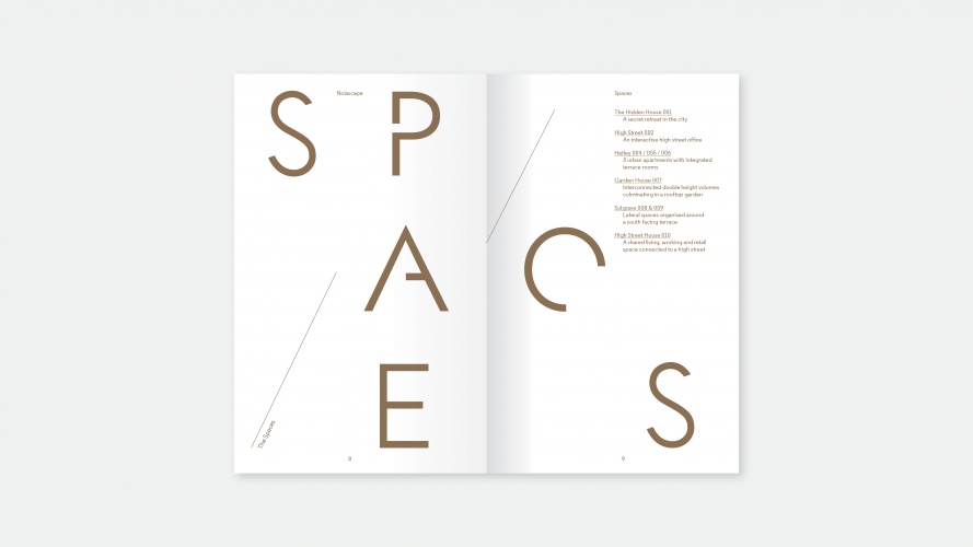
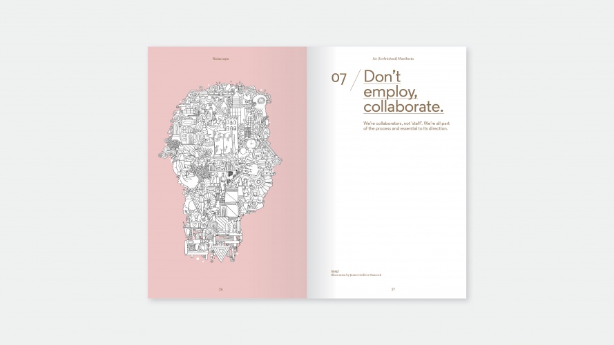
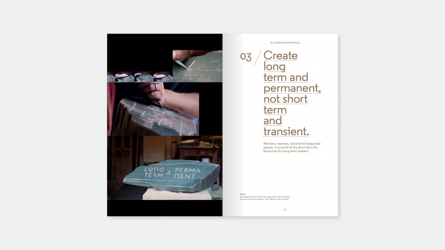
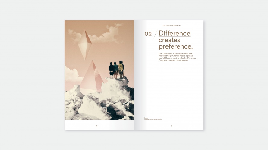
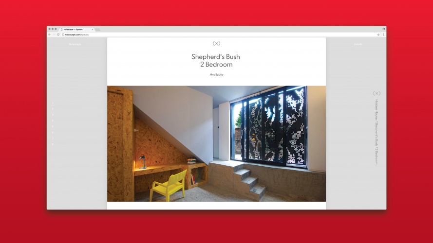
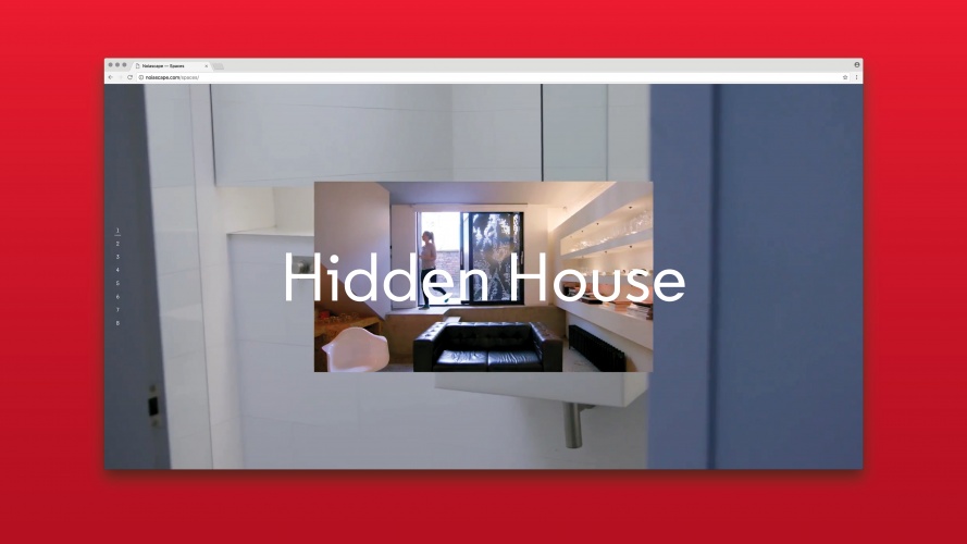
Peter and Paul has created a “manifesto” for the brand and designed the website, which includes sections such as “Spaces” and “Today” in order to suggest a state of flux.
Peter and Paul managing director Peter Donohoe, says: “The unique model of Noiascape had to be represented in a subtle and interesting way. We threw out the traditional brand mark, brand positioning statement and strapline and replaced it with insight and an incomplete manifesto.”


-
Post a comment


