Information is Beautiful recognises the best data visualisations of the year
We take a look at some of the category winners from this year’s Information is Beautiful awards, which looks to show “ideas, issues, knowledge, data – visualised”.

Information is Beautiful, which celebrates the best in data visualisation, infographics and information art, has named the winners of this year’s competition scoop £20,000 in prize money.
This year non-commercial work by individuals, publishers and independent studios has been entered for free in a bid to broaden the scope of entries.
An international judging panel made up of designers, educators, and writers working in the field includes communication designer Eric Klotz and infographic pioneer Peter Grundy.
Data Visualisation winner

Vaccines and Infectious Diseases won the Data Visualisation category by showing how the number of infected people measured over 70-some years and across all 50 US states and the District of Columbia, generally declined after vaccines were introduced.
Recorded as a heat map it shows the number of cases per 100 people.
The entire graphic was first published on the Wall Street Journal here.
Infographic winner

Rare earth elements are metals considered to be of great economic and technological significance. Used in renewable energy solutions, their demand is rising, putting future supplies at risk. Despite their value only 1% of REE are recycled.
More than 90% of rare earth elements are found in China where the fallout from mining and production causes environmental damage – in the majority of cases radioactive and toxic waste.
This infographic is one of a series of posters, designed to give an overview of the topic, demonstrate the value of REE, while also highlighting domestic recycling behaviour.
It was created by Bludau as a thesis at the FH Aachem.
Interactive winner

Published by the Washington Post here, this interactive allows readers to simulate how quickly ten diseases can spread from one person to 100 unvaccinated people.
Mini and Mobile Visualisation winner
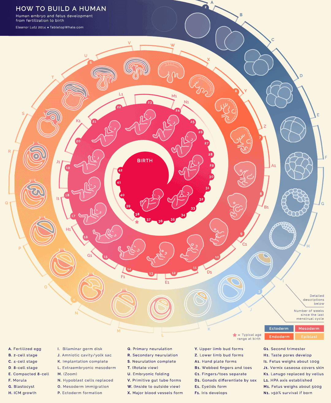
Lutz made this visualisation using 44 animations that re 9 frames each, which is 396 sketches – “Probably the most complicated GIF I’ve made so far,” she says, adding: “I am a little sad that I wasn’t able to show size properly though. For example, the 24 week fetus is about 40 times heavier than a 12 week fetus – but you can’t tell that from this drawing.”
Most Beautiful winner


These friends communicated via annalogue visualisations. Dear Data aims to capture and display every part of their lives.
Student winner by Sara Piccolomini

by Sara Piccolomini
Piccolomini has looked to show the levels of freedom experienced in different countries according to Freedom in the World, Freedom House’s flagship publication, which is considered a standard for political rights and civil liberties.
To see the full list of winners and runners up head here.
Read this next

-
Post a comment


