
Designers are helping esports brands sharpen up as business booms
As the global competitive gaming sector soars, designers are helping esports teams and organisations face the future without forgetting the past.
Esports – once a niche sector for videogame enthusiasts – is now a global industry. Viewership of competitive gaming is expected to rise from 454 million in 2019 to 646 million by 2024. If that figure is reached, the audience will have almost doubled in six years.
That kind of expansion can cause growing pains. When pioneering esports team Ninjas in Pyjamas (NIP) approached Motto for a new look, a “drastic transformation” was needed, the New York studio’s co-founder Ashleigh Hansberger says. The new identity, revealed in January, is the latest in a long line of recent rebrands in the sector. “NIP has been going through a lot of changes,” she says. “They had been undefeated for a huge winning streak, but they’ve been stuck in that memory.”
The Swedish esports organisation was founded in 2000 and boasts teams that cover a variety of games, though it’s perhaps best known for its early success in Counter-Strike. Its fan base is in the millions, according to Motto. Since NIP’s beginning, the sector has grown into a billion-dollar industry, reaching the mainstream with celebrity endorsements from the likes of Drake.
While multi-player competitions have long been popular for gamers, organised competitions developed in the 2000s. Professional gamers compete in a variety – from first-person shooters to battle royales – for prize money. And in 2019, over £150m was awarded as prize money across 4,000 competitions.
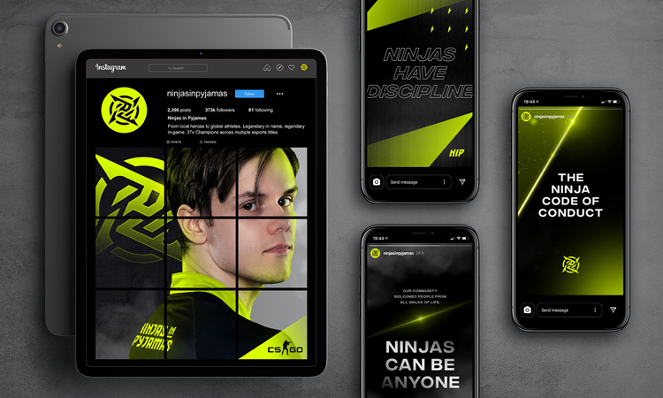
Motto’s work for NIP is a “rare-breed” move, Hansberger says. It’s changed from a brown identity to an electric cyan-and-yellow look, and its Japanese symbolism has been accentuated. The challenge here was between existing fans – who still felt a loyalty to the old branding – and where esports need to grow, according to the designer.
“It’s drawing a much younger fanbase,” explains Hansberger. The fans who were playing in 2000 are probably now spending less time gaming, and so the branding needed to appeal to younger fans. “Teenagers are a real sweet spot for esports brands,” the designer says. “We wanted to inspire a new generation of fans and really welcome them into the new NIP.” (The studio did warn NIP that heritage fans would be “very upset” with the change.)
Chasing a “cool” brand

The new identity drew upon the brand’s Japanese inspiration, using symbolism from the shuriken (a ninja’s weapon) and tying in associated characteristics. Even internal strategy is about “thinking like a ninja”. It helps, the studio says, to picture players and fans like ninjas – skilled and mysterious. Motto co-founder Sunny Bonnell adds that the team looked at Tokyo’s city sky-line, zooming in on lighting details for inspiration while the blue and yellow is a nod to the organisation’s Swedish background.
Motto identified a few areas for the new branding: it needed to look good in busy multimedia environments for the sporting tournaments, for one. Another key focus was merchandise. In this area, chasing an elusive “cool” was sometimes difficult, Bonnell says. The designer says that the team often asked themselves whether they would wear the new symbols on sweatpants or hats. Bonnell likens this to sports merchandise where a college or team logo creates an emotional bond with fans.
Hansberger highlights the “handcrafted” feel of the new logo as one of the distinguishing features of the identity. Not only does it tie in the Japanese inspiration, but it also helps NIP stand out in an increasingly crowded and digital-facing sector. Both designers note how the previous branding didn’t have much to do with ninjas or pyjamas but that leaning into an origins story can help these brands grow with purpose.
Mining the the heritage of esports
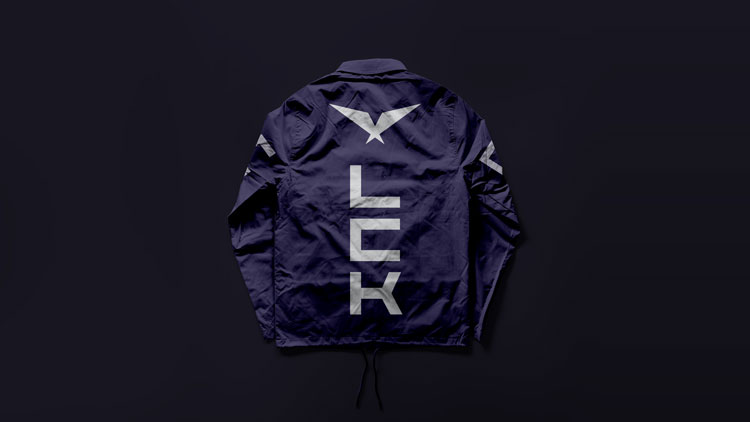
That’s true of League of Legends Champions Korea (LCK), which also revealed a rebrand this year from DesignStudio. The studio has previously worked on League of Legends brands – the European and South American version – but the South Korea branch presented the “richest heritage”, DesignStudio creative director Elise Santangelo says.
League of Legends is a team-based game created by developer Riot Games in 2009 – now 115m people play it each month. LCK is Riot’s Korean league comprising ten teams who have won nine titles since 2012. While acknowledging that heritage, Santangelo says the design team approached the project as complete beginners or “noobs”, in videogame-terms.
Perhaps the most important aspect of this research phase was playing the game itself, which is simple enough as you only need a computer and an internet connection. Santangelo says that the competitive and fantastical elements of the game are what made her become a fan. It soon became clear that the design had to embrace the “spirit” of the sports, she says.
“Koreans don’t want to be told what Korea is”
In South Korea, that spirit is specific – not just in terms of the precise and technical game play – but also in how esports are viewed by the general public. There’s a greater reverence towards the sector in the country according to the designer, and the identity plays off this heightened reputation. Famous moments in the league’s history are recalled in campaign materials, for example.
The team was also keen to draw on its Korean roots, weaving Hangul (the Korean alphabet) and English headlines together. Some sensitivity was necessary here. “Koreans don’t want to be told what Korea is,” she explains. The design team drew from multiple inspirations – from the film 2001: A Space Odyssey to historical monuments and historical architecture. This was all about “creating a sense of awe”, the designer says.
Meanwhile a “cloudy” colour palette has been used which adds to a sense of mystery around the league, she says. The typeface Chaney was chosen too for its architectural look, reminiscent of columns. The identity was all “about taking up space,” the designer says, pointing to the logo of a pair of outstretched wings. This is a departure from the previous design’s eagle motif, which Santangelo says was reminiscent of generic American branding.

Like Motto’s work, the identity attempts to cut through the sector’s noise with its minimalist styling – though it’s not without its “epic moments”. At one point, a crystal inspired by the Nexus (a team has to destroy the opposing team’s Nexus to win a match) explodes on the screen. “It feels like they’re playing on a higher level,” Santangelo says.
The designer points out that while very few esports stars are women, many LCK viewers are female. Worldwide, the percentage is growing and the branding aims to appeal to a wide audience. A lot of consideration was put into how esports are broadcast, for example. Santangelo explains that it’s different to traditional sports – usually just broadcast on television – because the identity has to stand out across streaming platforms such as Twitch, YouTube Gaming and apps like TikTok.
Santangelo believes there will be a mainstream crossover for UK esports in the next few years. It’s embedded in east Asian countries, thanks in part to the abundance of internet cafés. “Instead of going to play football after school, you would head to the internet cafes,” Santangelo says. She adds that a collaboration with a lifestyle brand, perhaps in the sporting category, could help with recognition.

“There’s always a challenge in trying to codify something so unique”

The current rebranding trend extends beyond leagues and teams. DreamHack started as a small LAN party in Sweden in the early 1990s. Since then, the production company has grown into a full-scale esports platform with international tournaments. It recently merged with Esports League (ESL) to become one of the biggest esports organisations in the world. At the end of 2020, it unveiled a new identity designed by Superunion.
“There’s always a challenge in trying to codify something so unique,” Superunion creative director Marta Swannie says. “Too much – and you risk squashing its spirit; not enough – and it may be incomprehensible.”
Like NIP and LCK, the project was about respecting the history and building on it. The new visual identity draws on the image of a “living warp” made up of screens which is a reference to the community’s LAN heritage. An orange colour palette and Tusker Grotesk typeface have “re-energised the graphic language”, according to the team. The ambition is to create a space where fans can “express themselves freely and share passions that may not have been understood outside its doors”.
Tone of voice was crucial for this and is an attempt to recreate the spirit of the events. “Being at DreamHack is a little like being in an alternative reality,” Swannie adds. “It’s totally fun, irreverent, a bit crazy and a little surreal – but it’s also quite normal.” It is essentially, she says, “a bunch of people from around the world being part of something they love”. Billboards read: “Leave Planet Boring”, “Swim the Ocean of Screens” and “Unreally Real”.
Once again, the rebrand had to toe a line between fans’ love and future growth. Superunion designer Erik Brattested acknowledges the “grassroots originals” of DreamHack. “There will always be nostalgia and attachment to the old brand,” he says. Only a subtle adjustment to the logo was a nod to those who have attended the LAN part for over two decades, according to the designer.
“But the gaming audience has grown up so much since DreamHack started,” Brattested says. “We wanted to make sure the brand is welcoming that new audience with open arms.”
Read this next

-
Post a comment


