5 important things that happened in design this week
From a string of Adobe Creative Cloud updates, to a look at recent US presidential branding, we round up the important design news from the last seven days.
Kingsmill rebranded for the second time in two years
Bread brand Kingsmill revealed a new logo this week, just 18 months after its last rebrand.
The new visual look ditches the steely, clean navy blue branding for a warmer, softer yellow look, with a logotype in a hand-painted style.
It has been redrawn by BrandOpus, which also designed the previous branding launched in May 2015. Kingsmill says the company has rebranded again so soon to give it “greater shelf standout”, while executive creative director Paul Taylor says a “dramatic change” was needed to keep up with the sliced bread market, where sales are “in decline”.
The consultancy adds it wanted to move the brand away from connotations of “mass-manufacturing” and more towards bakery and homeliness.
Adobe revealed its updates to Creative Cloud
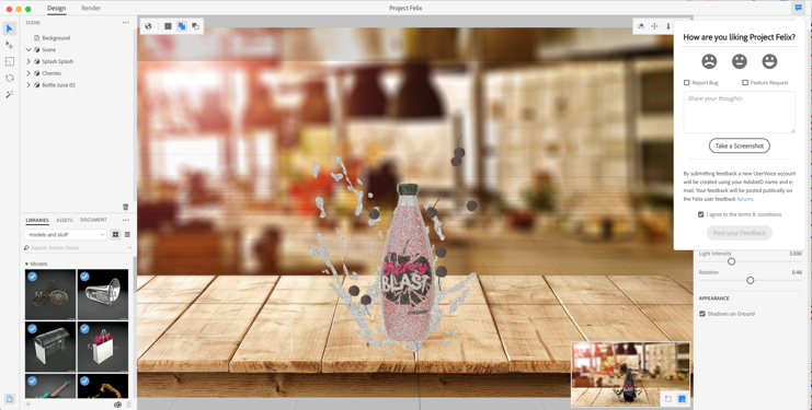
The latest Adobe updates and programs were revealed at this year’s Adobe Max conference in San Diego last week.
This includes Project Felix, a new graphic design program which will allow users to create product shot compositions and scenes using both 2D images and 3D objects.
Existing programs have also been updated with more co-editing and automation capabilities, meaning less skilled users will be able to master the program more easily.
When we asked the Adobe chiefs whether they thought intelligent automation could reduce designers’ core skills, they said that the intention was the “exact opposite” and that they hoped the new tools would make design a more widely-acquired skill.
“The democratisation of design only increases the value that people place on it,” says Abhay Parsnis, Adobe chief technology officer.
Read about all of the latest updates here.
We looked at US election graphics from the last eight years

Americans took to the polls this week to choose their next president, and the world was astounded when controversial, inflammatory Donald Trump beat his opponent Hillary Clinton by a majority.
In the lead up to the election, we looked at the logos and campaign graphics of the US presidential candidates from the last eight years, from Barack Obama’s popular sun rise icon which went viral in 2008, to the somewhat obscene Trump Pence logo which was scrapped and replaced this year.
Traditionalist values seem to go hand-in-hand with traditionalist graphics, the main trend being that Republicans opt for the plain logotype, while Democrats employ the use of professional designers to create nuanced, metaphorical icons.
But we won’t pass judgement on what that says about how much each party values design and creativity, it’s fair to say the Democrats’ branding is a touch more nuanced and tongue-in-cheek.
Take a look at our full feature here.
A new mentoring scheme was set up for female designers

Gender equality design organisation Kerning the Gap (KTG) has set up a new scheme which is hoping to raise women’s profiles in the industry.
It has partnered with mentoring organisation Conversation Space, and hopes to increase the representation of women in the design industry at senior levels, which Kerning the Gap founder Nat Maher says is “woefully behind” other sectors.
The KTG Mentoring scheme will allow those who sign up to “make connections” and have a “structured learning programme with someone outside of your organisation”.
It costs £75 to enter the programme as a mentee. For more information, head here.
Royal Mail revealed a series of fun, festive stamps

Consultancy The Chase has designed this year’s Christmas stamp collection for Royal Mail, with cute illustrations by Helen Musselwhite.
These include a Christmas pudding, lantern, Christmas tree, snowman, stocking and robin.
Rather than drawing everything by hand, Musselwhite underwent an intricate process to create the character icons and the stamp backgrounds. This involved her making paper sculptures by hand, folding them into festival scenes and photographing them.
The stamp collection went on sale this week and are available from Post Offices and the Royal Mail site.
Got a design story? Get in touch at sarah.dawood@centaurmedia.com.

-
Post a comment


