National Memorial Arboretum rebrands to make its logo clearer
The new logo alludes to the centre’s less well-known links to non-military related memorials, as well as the meaning of the word arboretum.
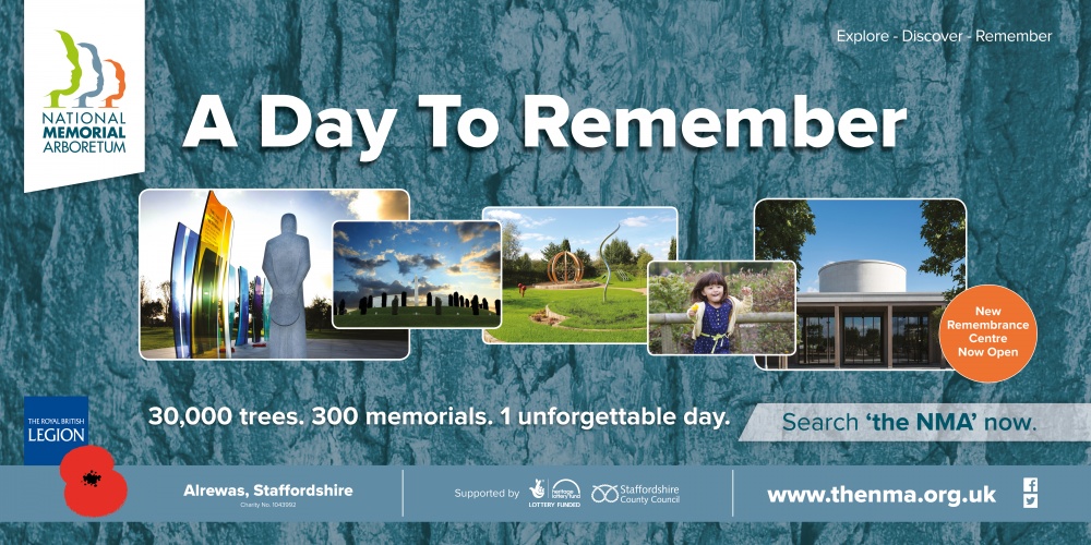
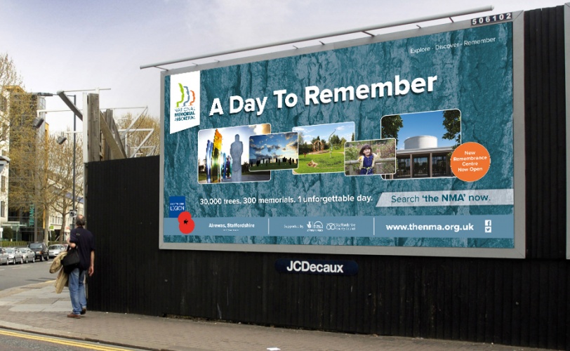
Marketing agency, Business Partners London (BPL), has redesigned the National Memorial Arboretum’s logo, coinciding with the opening of a £15.7 million Remembrance Centre at its site in Alrewas, Staffordshire.
The National Memorial Arboretum is a living, memorial centre, with 30,000 trees and 150 acres of land.
Having previously designed the Arboretum’s website, BPL was tasked with moving on the previous logo, which it says didn’t make clear its links to non-military related memorials. These include the Gift of Life Memorial, which recognises those who have given organs or tissue in life-changing procedures.

The previous logo was also difficult to use across different touchpoints due to its format and colour, according to the Arboretum.
Respect heritage
BPL was briefed to respect the “deeply engrained” heritage of the Arboretum, while also making sure it would resonate with future visitors.
Creative director at BPL, Andy Mackenzie, describes the agency’s approach to the redesign as “softly, softly, catchee monkey” – an old proverb meaning to be patient.
“The Arboretum carries on the great tradition of the Royal British Legion, so we had to handle the design aspects very carefully and be mindful of the emotional attachment many people have to the Arboretum because of its traditional links to the military,” says Mackenzie.
“The need to move the brand forward and attract different audiences was crystal clear in the brief so involving supporters, veterans, and volunteers was critical.”
“Humanity in the living landscape”
The new logo design is based on the theme of “humanity in the living landscape”, and sees three faces within an avenue of trees.
The sculpture-like faces are designed to reflect the monuments and memorials found throughout the site, while the trees communicate the meaning of the word “arboretum” (a collection of trees). Research had shown that people had been uncertain about the meaning of the word previously.
A new colour palette now includes green (chosen to represent trees), grey and blue (public service) and orange (positivity). A “strong” typeface – Proxima Nova – was chosen for its modernity, while also translating well to digital formats.
Two versions of the new logo – one with a strapline referencing its links to the Royal British Legion and one without – have rolled out across all touchpoints.


Read this next


Which artist designed this logo.
A good solution using a tried and trusted method combining people with shapes. They can get a lot of mileage out of this across all media.
It’s a little lacking in imagination & old fashioned. Personally I find the colour palette uncomfortable.