
Young’s Brewery given rebrand with “attitude”
The new look, developed by Cornwall-based designers Kingdom & Sparrow, aims to get the “newer generation of beer drinkers” engaged with the heritage beer brand.
Young’s & Co. Brewery has rebranded with the intention of making it more relevant with today’s younger beer drinkers.
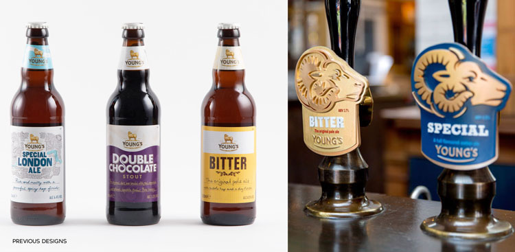
The project was led by the team at Kingdom & Sparrow, and comprises a bespoke typeface, new colour palette and an update for the brewer’s ram mascot.
“A little bit disconnected”
Reacting to the continued craft beer boom, the team were tasked with creating a brand capable of going head to head with more modern brewers. Prior to the rebrand, the team say Young’s was getting overlooked by consumers because of outdated perceptions about cask ales and bitters in particular.
“Their previous look wasn’t standing up to competitors in the contemporary beer market,” says Hannah Bevan, client director at Kingdom & Sparrow. “It was a little bit disconnected.”
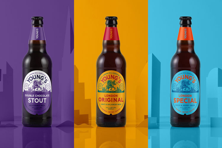
The rebrand has thus been targeted at the entirety of Young’s offerings, to create what Bevan calls a “coherent design system” for all present and future drinks. So far, they’ve translated this “youthful” new look to drinks packaging, ale pump clips and some glassware products.
“Getting the balance right”
Because of its history within the city, London acted as the starting point for much of the refresh. “It was about bringing London to the forefront, and helping Londoners feel much more ownership over the brand,” says Johnny Paton, creative director at Kingdom & Sparrow.
“With so much history, we didn’t want to completely abandon what makes the brand recognisable and loved, so for us it was about taking those heritage cues and giving them a contemporary twist,” adds Paton. “It was about getting the balance right.”
Keeping its London heritage in mind, the bespoke typeface created by the team takes inspiration from the original 1916 Johnston Sans font created for the Underground. “It gives people a sort of unconscious connection to the city,” Paton says. “None of it is about being obvious, it’s about giving people those subtle nods to the city.
“It was important for us to treat London not in the way a tourist might, we wanted it to feel like it had come from the culture and history of the city, because of course it has.”
“Youthful and energetic”
Beyond the new typeface, Young’s ram mascot has been rethought to give a feeling of confidence to the brand. The previous ram, the team say, was pictured as shy and static, whereas the new design brings attitude and a sense of pride.
“It was quite a bold move for Young’s to consider a design unlike what they had used before,” says Paton. “The ram they’d been using was a traditional Dorset ram, and this new one is a kind of hybrid of breeds and it just feels a lot more youthful and energetic.”
Paton also points out the ram had to be stylised to reflect Young’s position in the city. “Using a ram as the emblem, it can feel quite rural, so we needed to focus on the history of the brand in and around London,” he says. The new and improved ram therefore is therefore pictured jumping over a stylised version of the London skyline.

“Loyal customers have always been a part of the brand”
With the push for attracting new customers to Young’s heritage offerings at the centre of the rebrand, the team were keen to make sure existing fans weren’t left out of the finished product.
“It’s about inspiring new people to venture to the other side of the bar and try something new,” says Bevan, who adds that attracting younger customers to some of Young’s more traditional offerings was a big part of the challenge.
She continues: “But it’s not about alienating their loyal customers, we want them to feel like they’ve come along on this journey with Young’s, like they’ve always been a part of their brand.”
Read this next


Creating a nostalgic design looks great on paper… or on a computer screen when you line them all up, BUT Its essentially the same design, with a colour change… That’s a bit lazy, because the beers with character such as Double Chocolate and London Original each deserve a more individual design, rather than this cookie cutter (or coherent design system jargon) approach.
The Ram jumping over the London skyline maybe works for the Cityscape beer, but it looks like one piece of clip-art jumping over another, and the’unconscious connection to the city’ (more Jargon)… with the typeface – it looks nothing like Johnston Sans – its more like a squashed version of Copperplate Gothic.
When you look at what Fullers and Marstons are doing with their beers, this rebrand is all a bit twee really… but not in a good way.