Rip Curl rebrand rides the waves
Surfing brand Rip Curl will launch a revamped brand designed by The Nest this month, as the company moves to build global consistency and target women more effectively.
It is the first time the company has worked with an external group, and the consultancy’s work will be applied across packaging, in-store graphics, advertising and corporate brochures.
The Rip Curl name and marque remain unchanged, but the work encompasses the broader brand collateral, including visual guidelines, a specially created font and the introduction of a ‘stronger verbal identity’, says The Nest strategy and communications director Freddie Baveystock.
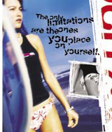
‘In the past [the brand] has thrived on visual communication and endless action shots of heroic surfers. We’ve brought words into the picture,’ he says.
The group’s work also focuses on aligning Rip Curl Girl more closely with the main marque, essentially creating ‘a unisex brand’, Baveystock adds.
‘It’s a big change for the brand, which has had a very masculine focus,’ Baveystock explains. ‘Rip Curl Girl felt like the brand’s little sister. This generation of female surfers are very skilful and we want to give them due respect’.
The Nest was appointed in November last year and senior designer Jake Ronay worked with creative director Charlie Kinsman on the project.
Rip Curl launched in Australia in 1969 and now has retail outlets in the US, Britain, France and Brazil.
-
Post a comment


