
Astrid Stavro’s “tongue in cheek” identity for cereal brand OffLimits
The “next-gen” cereal brand has been branded by the graphic designer alongside illustrations from Shepard Fairey’s Studio Number One.
Pentagram graphic designer Astrid Stavro and Shepard Fairey’s Studio Number One have created the branding for new cereal company, OffLimits.
OffLimits – founded by Emily Elyse Miller – is a “next-gen” cereal aimed at adults. It has two flavours which aim to match people’s mood; depending on whether they’re feeling ‘wired’ or ‘tired’.

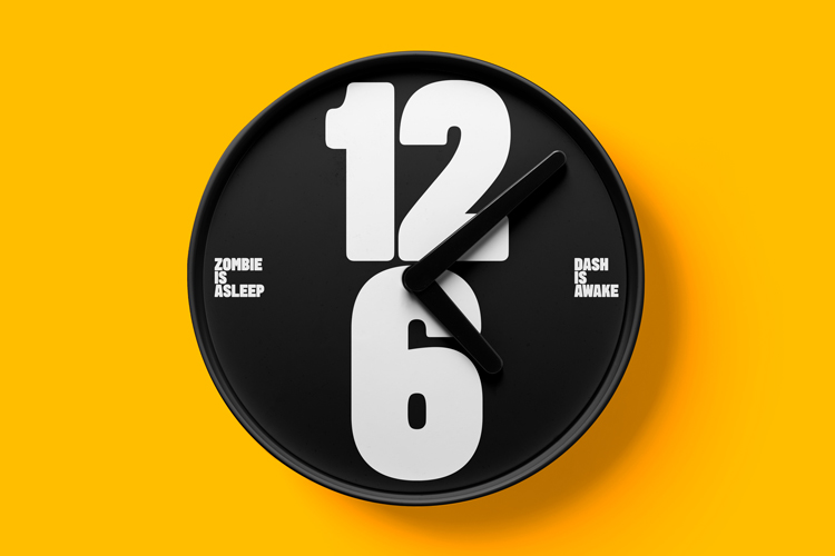
The two flavours, the caffeine-infused coffee and cocoa and the more “mellow” vanilla and pandan, are represented by two different characters. Dash the rabbit represents the former while Zombie represents the latter. As well as signalling the different flavour profiles, these two mascots are part of the brand’s aim to “destigmatize difficult conversations around mental health”.
The cereals contain “carefully constructed” activity sheets and activities that seek to relieve anxiety at any time of the day, not just breakfast. The name OffLimits has a dual purpose, according to the cereal’s founder. “It’s a playful take on the sugary treats that always seem to be out of reach when we’re young and also represents the element of defiance that’s ingrained in the brand’s DNA,” Miller says.

“More than a cereal brand”
Pentagram’s Astrid Stavro tells Design Week that her aim was to distinguish OffLimits as “more than a cereal brand” by focusing on its “tongue in cheek, quirky and playful attitude” as well as its “rebellious spirit”. Stavro says she approached the project as a lifestyle branding brief, rather than specifically cereal.
The characters have been designed by Shepherd Fairey’s Studio Number One in Los Angeles. This was a collaborative effort with Stavro’s team based in London. Studio Number One “really brought the characters to life, down to the smallest details including the brilliant idea of the character mascots”, Stavro explains.
Pentagram then worked with the American studio on “refining” details like the colour palette, body movements, expressions of the eyes, right down to the types of shoes and haircuts. “Close-ups of elements such as the eyes, hands and shoes were used for different parts of the branding and packaging,” she adds.
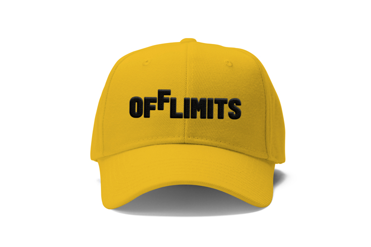
The logomark is a simply designed “visual interpretation” of the brand’s name. Stavro explains how the team found a picture of a boy stretching his arms to get into a jar of cookies. “That’s when we had the idea of placing one of the letters – ‘f’ – slightly ‘off limits’, like the jar in the picture,” she says.
A singular point of view

The two characters are an attempt to illustrate the brand’s singular point of view. “The characters and their mascots have their own voices, personalities and points of view,” Stavro says. They are reminiscent of Pirandello’s ‘Six Characters in Search of an Author’ or Flann O’Brien’s ‘At Swim-Two-Birds’, according to the designer.
From these off-beat reference points, a “bespoke and cohesive” world was built through the use of saturated colours, custom-made typeface, tone of voice and supporting illustration. “It was important to build a strong sense of community with the characters as well as the consumers,” Stavro adds. This universe will be added to as the brand develops and the ways in which the character interact with each other are a key part of the identity according to the studio.
An expansive visual universe has also been created, complete with animations. This is a further expansion of the brand’s “playful and tongue in cheek attitude” which Stavro hopes will “bring the brand to life beyond the brief”.
Proposed brand merchandise includes apparel such as caps and T-shirts, as well as home accessories like clocks and mugs.

-
Post a comment


