
A gin brand that celebrates the “geological tapestry” of the Peak District
The identity for Shivering Mountain takes inspiration from the geological and botanical influences on the area, and introduces the world to the concept of “ginology”.
London-based design studio The Allotment has developed the branding for a new craft gin distillery, Shivering Mountain.
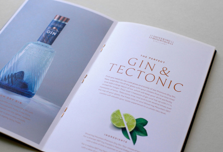
Shivering Mountain Gin is a newcomer to the UK gin market, with a distillery based in the Peak District. The combination of geological forces experienced in this location, the brand says, has a unique effect on the taste of the gin produced here, with water filtered through the mountains used in the distilling process.
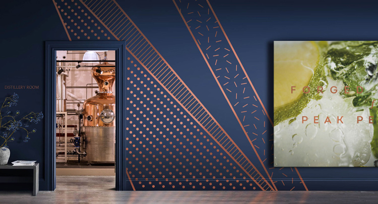
The Allotment was brought in to create an identity for the brand which celebrated this, resulting in a bespoke bottle design, distillery name and logo and a geological and botanical-inspired visual language which have been used across communications, the website and in house at the distillery itself.

“Weeks and weeks” of work
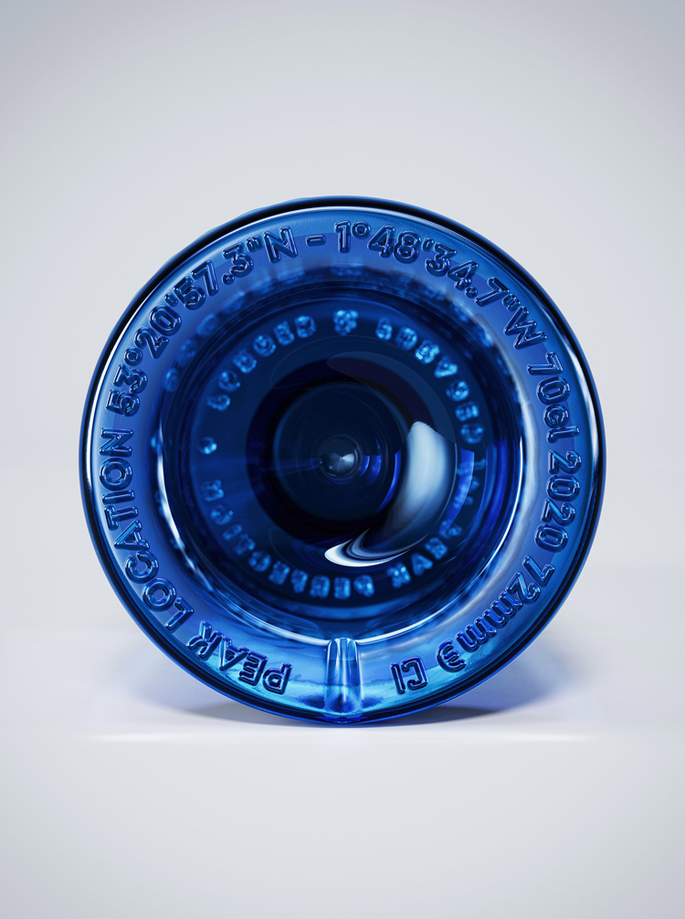
The centrepiece of the project is the custom designed bottle which features a depiction of Mam Tor, the mountain in the Peak District known locally as Shivering Mountain because of frequent landslides, and its geographical co-ordinates at the bottle’s base.
The bottle, which when turned gives the effect of the mountain “shivering” thanks to grooves on its surface, was the product of “weeks and weeks” of work, according to The Allotment co-founder and creative director James Backhurst.
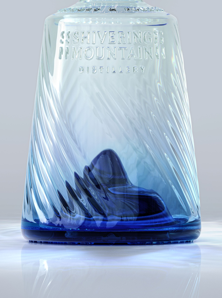
“We had to craft the angles just right so that the mountain would actually shiver – the ribs that go around the bottle needed to be perfect,” he tells Design Week, adding that the CGI renderings of the bottle were enough to convince Shivering Mountain founder and managing director Nick Malaczynski that a bespoke bottle was the way to go.
“Originally, Nick was thinking of working with an off-the-shelf bottle, because obviously as a start up it’s a big investment.”
“The bottle demands attention”
While at the centre of the branding, and indeed one of the brand’s biggest assets according to Backhurst, the bottle presented the team with challenges beyond just getting the optics right for that all-important shiver.
The nature of where the product will be sold meant extensive lighting tests needed to be carried out – as Backhurst explains, Shivering Mountain could be featured on the shelves of rural pubs, all the way to nightclubs or department stores and thus needed to look good in all lighting situations.
“The whole idea is that the bottle demands attention, and for that to happen it needed to look good in a dark environment, a backlit environment, or a lighter environment,” he says.
Additionally, it needed to be produced on a line using moulds. This gave way to certain engineering requirements.
“When designing a bottle initially, you focus on creating a singular product that works perfectly – but we needed to then work with a glass manufacturer to work out how it could be mass produced,” Backhurst says.
The shoulder of the bottle, for example, features text which could “drag” when the molten glass was released from its mould. The team had to work to produce a shoulder at an angle for easy release. It has also been weighted with bartenders in mind, Backhurst says, so that they can “throw it around” when making cocktails.
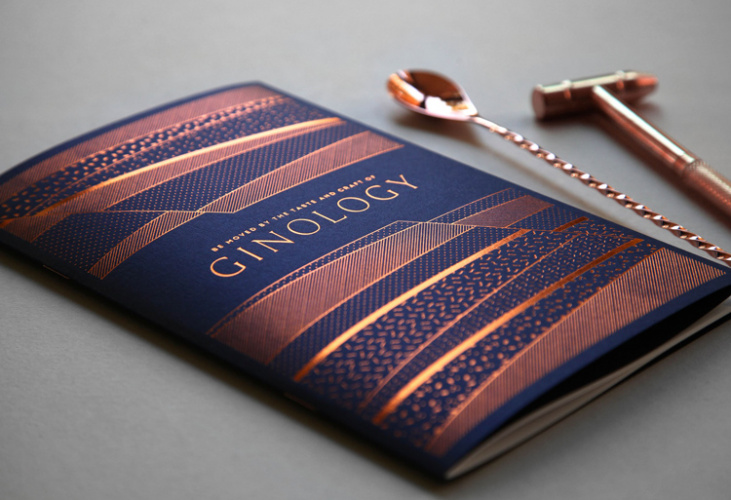
“Ginology”
Beyond the bottle, the visual identity for the brand has been informed by the Peak District’s unique ecological, botanical and geological make up. As Backhurst explains, there are some 800 gin brands on the market in the UK, so the task centred around finding the “depth and detail”.
“A lot of brands will have a really nice looking bottle and label, but not much more,” he says. This is where the concept on “ginology” comes from, which, much like a wine’s terroir, is the studio’s way of telling the story of Shivering Mountain’s offering.
Using research into the region’s history, the team made design decisions. The colour scheme, for example, is inspired by the minerals once mined in the area: fluorite crystal (blue) and copper.
Additionally, geological diagrams have informed the visual language. These codes and conventions give the identity a deeper meaning, Backhurst says, but similarly it doesn’t take away from the experience if consumers don’t understand the maps and dot references – “it’s still a beautiful result whether you ‘get it’ or not”.

“A sense of pride”
As for the logo, the team were conscious not to “overegg” the design, he says. With Shivering Mountain positioned as a premium brand, they were keen not to look “cheap or crude”.
The shivering motif is subtle, he says, while the “N”s lining up as part of the fault line of the mountain ensure “there’s no doubt about the influences and origins of the gins”. The whole project, Backhurst says, is designed to make the brand a “talking point”.

“The bottle, the authentic story and the experience are all designed to start conversations and bring a sense of pride to this beautiful part of the country,” he says.
The brand will launch later this year, with a range of other assets designed by the Allotment team planned for the future, including a “Ginologist’s Essentials” kit.


Lovely concept. Beautiful part of the country. Was any consideration given to maybe using a design agency based in the local area instead of London?