
JKR “celebrates simple greatness” with masterbrand refresh of Heinz
The project, which includes updates to the logo, visual identity, packaging and touchpoints, is the first ever global masterbrand for the 151-year-old company.
Food manufacturing company Heinz has been given a global masterbrand by international design consultancy Jones Knowles Ritchie (JKR).
Established in the US in 1869 as a maker of horseradish, Heinz’s worldwide product portfolio now rests in the thousands. The masterbrand is the first of its kind for the 151-year-old company, and attempts to unify the brand’s ranges within one aesthetic family.
Having worked with Heinz on various products and activations for the last 15 years, the JKR team were tasked with leading the project, which includes subtle brand refreshments across packaging, visual identity and touchpoints.

Unifying the brand
Since Heinz operates using many different products, in many different markets, the first step in the masterbrand design process was to find a unifying theme.
“One of the things the Heinz team were keen to address was this idea that nobody could really pinpoint what it was the Heinz stood for,” JKR creative director Stephen McDavid tells Design Week.
This wasn’t to say there was no effort across the brand, rather that more effort had been put into products on their own, than the brand as a whole. As McDavid explains: “On an individual product level you could find some sort of personality, but Heinz itself lacked meaning.”
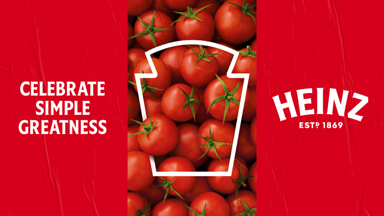
Wanting to change this, the team settled on the idea of “Celebrating simple greatness”. Once this had been established, focus turned to how Heinz’ assets could best be celebrated.
“The Heinz in the mind”
As McDavid points out: “Heinz is a brand that already has amazing assets.” At no point was there intention then of drastically changing what many had come to expect from the brand, as he continues, “It’s such a loved and iconic brand and we had to be hugely respectful in our role with that.”
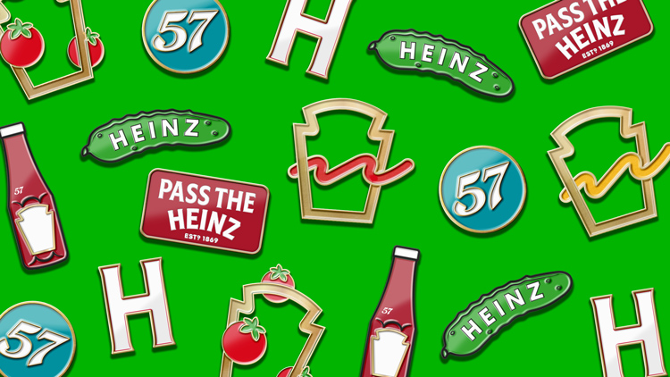
But while the Heinz typeface and keystone were iconic examples of branding, digging into the company’s archives revealed huge inconsistency of application, both throughout its history and present.
“The shape of the keystone was inconsistent across products – some used three lines, others four or five, some used thin lines, others thick,” he says, adding that typography across the brand was a similar story. No clear family of fonts had been established, and packaging often used a mix of upper- and lowercase lettering.

The task then was to find the most recognisable iteration of Heinz – as McDavid puts it: “We had to find the Heinz in the mind”.
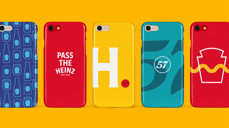
The updated packaging keystone uses just two strokes across all 20 product categories. Similarly, JKR’s typographic approach limited Heinz to just the one family of typefaces, and champions Heinz’ own bespoke font, Heinz Label, which had previously only been reserved for its “iconic” products.
“It was really a no brainer that we should hero Heinz Label in this, so we gave it a bit of a dusting off and put it front and centre across the whole project,” McDavid says.

A “sliding” personality scale
One of the biggest challenges throughout the project, according to JKR client service director Daisy Shirley-Beavan, was balancing the weight between an overarching masterbrand and an individual product’s “personality”.
“The big task was to make sure none of the products lost their charm amid this refresh,” she says, giving the example of Heinz Baked Beans tone of voice being “witty”, while Heinz Tomato Ketchup is more “discerning”.
To get the balance right, Shirley-Beavan explains the team created a sliding scale for five distinct personality traits: discerning, confident, down to Earth, welcoming and witty – somewhere along these scales sits each product.
“For Beans, we’d dial up the wit, and for Ketchup we’d up the confidence, so overall we could still exercise these personality traits, but within the parameters of the brand.”

“Living, breathing design assets”
Beyond the packaging, Shirley-Beavan says a sharp focus was also given to the life of the branding off-pack.
“We needed to make sure that it wasn’t simply a logo swap, but that our work made a sizeable difference to the brand,” she says. Particular attention was given to the keystone, which has been reintroduced as a kind of “living, breathing design asset”, Shirley-Beavan continues.
The team have developed a series of use cases for the keystone frame already, but as McDavid and Shirley-Beavan point out, these will be able to evolve and change in the future as Heinz requires.
Read this next


This story prompted a discussion between myself and a friend who is a creative about the possible effect of the coronavirus on the design industry and whether it will lead to a shrinkage in the market in the area of brand development. He said one noticeable thing that happened was brand allegiance went out the window when people experienced shortages of certain products. Consumers were not so bothered about their loyalties to specific brands as long as they were able to get their baked beans, flour, pasta and bathroom tissue etc. It suddenly became generic. Do others think this will have a knock on effect on the way we think about products in general.