Tate Etc magazine redesigns to have an “independent voice”
London-based studio Ard has worked on the redesign, which looks to differentiate the publication from the overall Tate brand and compete with other independent and mainstream art magazines.
Tate Etc has been redesigned to “restate the independence” of the contemporary art magazine, which is published three times a year by Tate but is editorially independent from the institution.
The new design looks to stop the magazine from being confused with Tate’s in-house promotional material, according to London-based Studio Ard, which was commissioned to work on the project by Tate Etc editor Simon Grant.
“Since its creation, the magazine was always willing to have an independent voice to compete with other independent art magazines. The challenge was therefore to detach the new design from the Tate identity while staying in line with the house attitude,” says Ard co-founder Daniel Nørregaard.
The studio has ditched the existing Tate identity previously used throughout the magazine and created a new logo based on the typeface RH Inter by Swiss type designer Robert Huber, which is a revival of a late 19th century grotesque typeface. It also switches from all capitals to lowercase lettering.
Cover design
Based on RH Inter’s original forms, Ard worked with Huber on the logo and tied it in with the Tate identity by adding features such as straight and rounded angles. Two weights of RH Inter are used throughout the inside of the magazine.
Ard was also briefed to make Tate Etc more accessible to its audience and give it more newsstand presence in order to stand out from other art and design magazines.
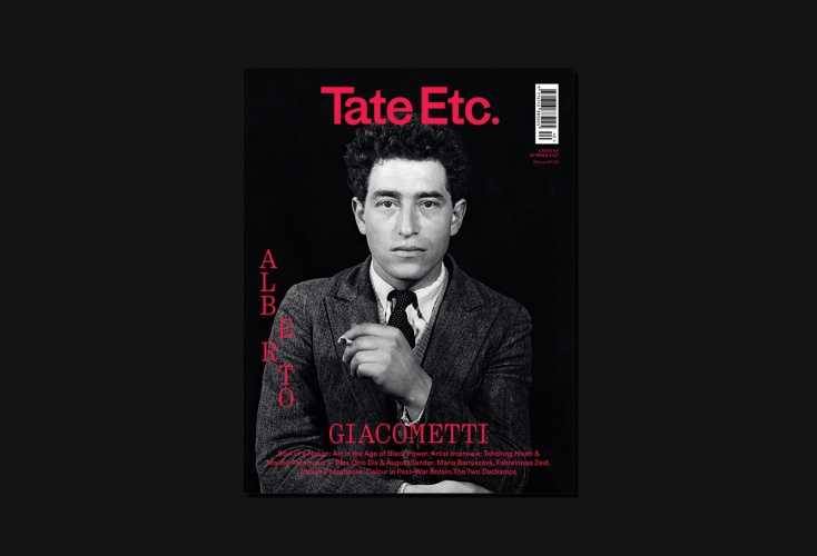
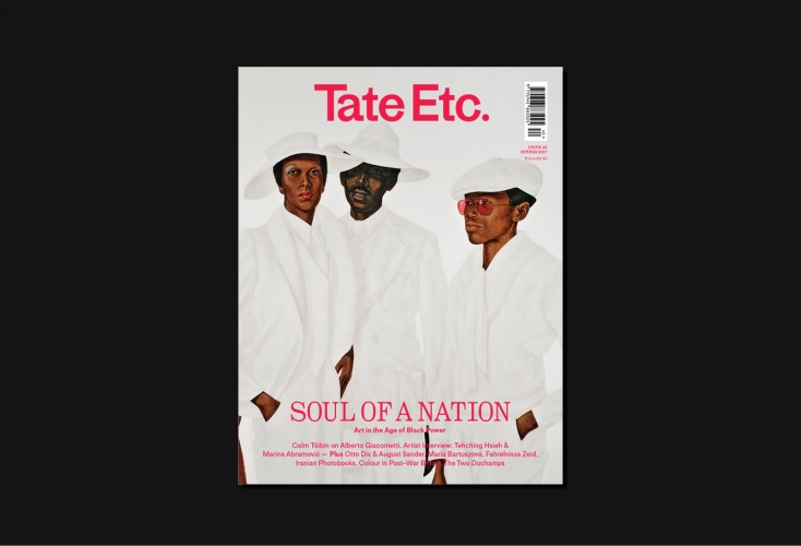
The cover is designed to look more like a mainstream magazine by using portraits for the cover image, adding more information about the content inside and giving the pricing more prominence.
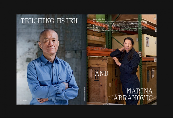
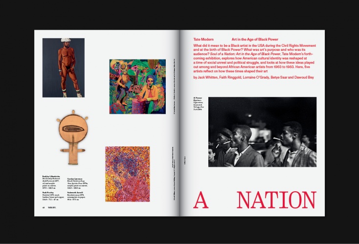
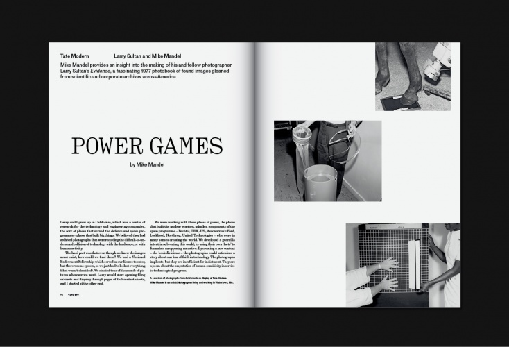
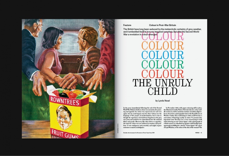
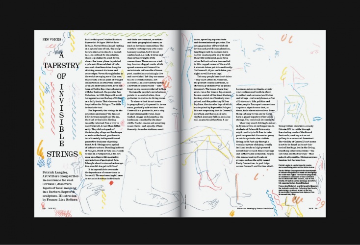
At the front of the magazine the design has been kept simple in order to reflect the journalistic nature of the content, but becomes more experimental towards the back as the features focus on more niche subjects.
“Brings rhythm”
“We’ve differentiated the three different sections clearly by gradually moving from a quite classic and bold approach in the front section, through to a more playful attitude in the back. This brings rhythm but also helps the reader to navigate the magazine,” says Ard co-founder Guillaume Chuard.
Tate Etcentury – a typeface based on Century Schoolbook Monospace and created in collaboration with Swiss designer Julien Mercier – is used for headlines and captions, and is incorporated throughout the entire back section. The body text is set in an early 20th century typeface called Century Schoolbook.
Ard says the design of the magazine will continue to evolve in the future and the studio is planning to introduce custom-made typefaces for each issue, which will be created in collaboration with different designers.
The first issue of the redesigned Tate Etc magazine is now available from retailers internationally. Readers can also subscribe online, and the magazine is available for free for existing Tate members.


Read this next


I happen to receive my copy of Tate Etc. this morning.
What an utter disappointment. For an arts organisation of the stature of Tate to put something out like this is an absolute embarrassment to the design industry. It is dreadfully clumsy with insensitive typography, amateurish layouts and no understanding of how graphics and type should work alongside fine art, along with bad placing of advertisements. What on earth has possessed the Tate to unleash such a bad piece of editorial/design smorgasbord on its’ members?
I absolutely agree. Has Siobhan fromW1A been involved!?
How very sad. I hate to criticise fellow designers, although as Design Week knows, I do when I feel it’s necessary. Seeing the newly designed Tata Magazine on my desk this afternoon, I was horrified. It’s clumsy, inept and insensitive. The typography is amateur and the layout and general feeling of it, well, to be direct, it’s just plain bad work. It’s become a shamefully disappointing magazine and unworthy of the Tate.
On reflection, and on looking again: No one can blame The Tate from wanting to take a fresh look at the magazine, to move it forward and increase it’s readership, but allowing the design and art direction to fall back to such a poor quality is surely not the way to go. We all make mistakes. It takes courage to admit them and start over. In this case, I’m sure it’s what The Tate needs to do and to do it before there’s another issue as conspicuously badly designed as this one.
A wise old friend once told me that great art must embody four elements: Unity, Vitality, Infinity, Repose. This unfortunate redesign is lacking in all.
I sent my criticisms of their first TateEtc., to the editor, but did not receive an acknowledgment. The latest edition has some very poor typography, page 12 caption is 99% unreadable.
Surely the editor should look at the design in proof stage and have it corrected before it is printed. So who to blame the designer or the editor?
Ivor Kamlish ex part- time typography teacher, Central, Hornsey, London College of Printing.