Mr Kipling ditches “heritage” in rebrand to attract international customers
Studio Robot Food has redesigned the branding and packaging for the North American and Australian markets, opting for a “contemporary” look inspired by European patisseries.

Robot Food has rebranded Mr Kipling for the US and Australian markets in a bid to make a bigger impact internationally.
The studio says that while the brand, which is owned by Premier Foods, is well known in the UK, in some international markets it is a “relatively unknown” competitor, which presents the opportunity to “reinvent” it.
Martin Widdowfield, creative director at Robot Food, says while the company “has a lot of heritage” in the UK, the current branding is not “making waves” in other countries.
“It was about doing something new and exciting, so they weren’t too worried about the current look and equity of ‘exceedingly good cakes,’” he says. “It was like a fresh start”.
Robot Food has confirmed that the branding and packaging will not change in the UK.
Senior brand manager for International of sweet treats at Premier Foods, Kimberley Tonge, says: “It was clear there was a great opportunity in both the US and Australia for Mr Kipling to provide a sophisticated, high-quality packaged cake, but entering as a challenger brand, Mr Kipling would need a bold new presence to compete.”
The design studio has aimed to create a “contemporary”, “exciting” and “premium” look, which looks to “set a design for the future”, and steers away from the heritage aspect of the brand.
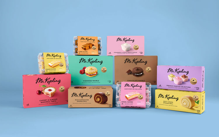
The packaging was redesigned with bright, pastel coloured-backgrounds opting for solid colours rather than patterns, which vary for each different cake. Photographs of the cakes have been placed in the centre as the “hero”, with images of key ingredients also pictured on some packages, such as cherries for the bakewell tarts.

“We drew inspiration from European patisseries and chose bright pastels for a fresh, contemporary aesthetic over stronger bold colours that risked feeling artificial,” says Widdowfield.
During research for the project, he says, it was found that a lot of “challenger patisseries dared to play with colour and dared to have a more playful look.”
The Mr Kipling wordmark has been kept, but “stripped back to just the signature, without any flounce,” he adds. The logo is now a flat, black colour, printed directly on the coloured background, rather than on a light-coloured label as in previous designs.
Mr Kipling’s script signature, which forms the wordmark, was created by illustrator Alison Carmichael with the consultancy Brand Opus in 2015.
The strapline, “exceedingly good cakes”, has been replaced by “Make every day delicious” for the international market.
“This was about adding a little bit of brightness every day for people,” Widdowfield says.
A small gold seal has also been added, which reads “expertly crafted Patisserie cakes”.


Odd not to mention Britain, even subtly, as the US knows us for our cakes (Bake Off is big there) rather than ‘patisserie’ (which Mr Kipling is not)
Mmmmm, we love the Great British Bake-Off, but I don’t think of Britain and Cakes and going together. Though imports are always exciting. And I think the *names* of the cakes somewhat implies their origin. We don’t have “bakewells” stateside.
I don’t think it matters though. The design is so good I just feel bad for Brits that they won’t have it. And I desperately need to find a shop selling these, because they look amazing.
Exceedingly over promising.