Inspired
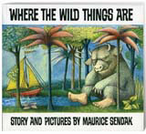
Inspiration comes in unexpected forms, as I realised when I argued with my four-year-old daughter over which book I should read to her.
Paul Barlow – L&Co Design
Inspiration comes in unexpected forms, as I realised when I argued with my four-year-old daughter over which book I should read to her.
I was all for Where the Wild Things Are, by Maurice Sendak (1963), because I wanted to look at that quirky typeface on the cover just once more. No surprise, then, that the e-commerce brand we are relaunching in January uses a dose of characterful, early 1960s typography.
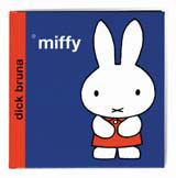
In many of these classic children’s books, the clarity and economy with which stories are told is something I still aspire to. Dick Bruna’s Miffy series, with their simple but lively lines, and use of almost exclusively lower case Helvetica Bold, pre-dates many ‘contemporary’ Minimalists by several decades.
The Dr Seuss books follow another fantastical path with their surreal animals and crazy rhymes and rhythms. But, despite their eclectic mix of subjects and characters, they are held together graphically with those bold red and white striped spines, that look suspiciously like a design system.
When I look at our recent work, creating the Diil mobile network brand with its hand-drawn type and quirky animal icons, it suddenly dawned on me where much of the inspiration had originated.
Maybe these books even inspired me to start on the design path the first time around – they have certainly captivated me four decades on.
-
Post a comment


