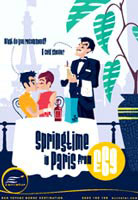
Client: EuroStar
For Rian Hughes, working on advertisements for Channel Tunnel operator EuroStar represented a ‘half-way house job’.

Agency: Rainey Kelly Campbell Roalfe/ Y&R
Illustrator: Rian Hughes
For Rian Hughes, working on advertisements for Channel Tunnel operator EuroStar represented a ‘half-way house job’. The basic concept was already in place, but he was asked to do a lot more than simply illustrate by numbers. ‘Often with these kinds of jobs I’m brought in as a stylist rather than a thinker,’ he says. ‘I prefer getting involved at concept stage, but at least in this case I was allowed to run with it,’ he adds.
The agency creative team presented him with rough ‘stick men’ marker pen drawings on an A2 layout pad, with completed copylines. From there he was left to get on with it. ‘There was a lot of freedom,’ he says. ‘The position of the figures and the copyline weren’t even fixed. They put more trust in me than a lot of [advertising] people do.’ The only constraint was that Hughes was asked to incorporate a fair dollop of blue and yellow, the EuroStar corporate colours, and to achieve a younger, hipper, slightly less retro feel than previous executions in the same campaign.
Hughes is a master of many styles, though he is best-known for his firm-jawed, tight-waisted comic-book figures, a product of his abiding interest in the genre and considerable time spent collaborating with various comic book artists and publishers earlier in his career. Working in Illustrator, his use of strong, flat panes of colour does bring to mind a vogueish early 1960s illustrative look, though he insists, ‘I don’t like pastiche and I’m not trying to mimic a historical style.’
Certainly, Hughes brings his own unique slant to his illustrative work by incorporating bespoke typography into many of his designs. A prolific typographic designer, he already has well over 100 fonts to his name – not bad going for someone in their early 30s. For the EuroStar ads, he created a medium version of his Slack Casual font, a jaunty, slightly jokey sans serif, which reflected the humour of the ads.
And of course, you get the typical Hughes drollery in the minor details, the wonderful fabricated names on shopping bags, designs on T-shirts, an anchor tattoo on a fishmonger’s arm, monogrammed embroidery on a waiter’s cloth. The backgrounds include stylised though instantly recognisable landmarks from Brussels and Paris, all executed with remarkable economy.
‘If you look back to the old advertising greats,’ says Hughes, ‘people like Cassandre, Jean Carlu, E McKnight Kauffer and Mucha, they were all consummate typographers and had great layout skills. The marriage of type and illustration hangs together perfectly. I still wince when someone says to me you do the illustration and we’ll get the type done in-house.’
For Hughes, advertising’s current absorption with illustration is simply a reflection of what’s happening elsewhere in visual media. ‘Advertising eats up anything that’s current,’ he says. ‘What’s going around at the moment is a new generation of illustrators who have rejected the bucolic country scene for something altogether more urban and scratchy. They’re au fait with computers and producing something that’s really fresh and exciting.’
-
Post a comment


