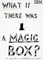
Client: IBM
Illustrator Paul Davis became involved in IBM’s international Black Box campaign after a chance meeting with the late Tony Arafin.

Agency: Ogilvy & Mather
Illustrator: Paul Davis
Illustrator Paul Davis became involved in IBM’s international Black Box campaign after a chance meeting with the late Tony Arafin. The former art director of ID magazine was then employed at ad agency Ogilvy & Mather’s New York office, and persuaded Davis to produce some roughs on the last day of his visit to the Big Apple. ‘I really didn’t feel like working,’ recalls Davis. ‘But I’m glad that I did.’
It was an inspired move. Davis’ rough, child-like style of drawing, and in particular his handwriting, were the perfect foil to IBM’s rather staid, intimidating corporate image. No matter how fast or efficient, a business server isn’t exactly a sexy product. While Davis returned to the UK, Arafin successfully sold the idea of using this rough-edged illustration – sometimes combined with photography, sometimes not – to the client.
It was the start of an 18-month project for Davis, which saw him produce literally hundreds of press ads and posters (as well as contributing to two commercials) that appeared as far afield as Italy, Spain, the Czech Republic, France, Germany, the UK and the US.
He spent his time commuting between O&M offices in New York, Paris and London, creating specially targeted variants to account for regional differences in the marketplace. The largest manifestation of the campaign was undoubtedly a 90-sheet hoarding that took up a whole wall on the outside of Nice airport.
‘[Entirely] illustrated ads were used more in Europe, because the cartoony, illustrative style is more prevalent and accepted than in the US,’ explains Davis. ‘In the US, it was more a mix of photography, hand-drawn type and the odd drawing.’ The type was characterised by a rough, pointy outline intermittently coloured in. O&M went so far as to buy the rights to Davis’s handwriting for a year – the typeface, which came in various weights, was christened (with a certain irony in its simplicity) Davis Bold, Davis Medium and Davis Light. Along the way, Davis became expert at rendering the rather characterless Black Box server, depicting it complete with cartoon stars overhead, to denote the frantic computer activity within.
Davis worked in a variety of media, from pencil and biro to marker pen and gouache. The images would then be scanned in to a computer and created in Photoshop. ‘As long as it looks good I don’t care,’ says Davis. ‘I love experimenting with different drawing implements.’
The effect of the campaign was both surprising and refreshing, very much against the grain of what the competition were doing at the time. ‘It stood out a mile,’ says Davis. ‘That’s the thing about illustration, you just need a simple, smart idea. You don’t have to have hair stylists and make-up and location recces and insurance. The market has been bombarded with photography over the past ten to fifteen years.’
However, he believes that photography will always have the upper hand. ‘People can relate to it because everyone has used a camera, it has a veracity when it comes to selling a product.’
-
Post a comment


