The finishing touch
Choose a paper stock that complements your brief and it can add a tactile dimension to the job, enabling your creative work to really stand out, says Kerstin Kühn
The catalogue is printed on Arctic the Volume, a high-bulk, matt, fully-coated stock, and consists of 38 book covers that are presented in various sizes, with explanatory text on the back of each page. ‘Arctic the Volume has a matt surface that aids high quality image reproduction, but at the same time retains a natural feel. Its opacity and stiffness make it particularly suitable for printing books,’ says Lucas Young, business development manager at Arctic Paper UK.
The selection of work featured in the catalogue ranges from Pentagram’s cover for Mary Warner Marien’s Photography – A Cultural History to Kylie Minogue’s self portrait Kylie by Farrow Design, and Alan Fletcher’s Garden Book design. ‘We want this catalogue to inspire publishers and designers to focus on the cover when they publish a book,’ says Kittel.
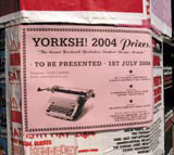
Brahm Design runs an annual regional student competition entitled Sh!. The award, now in its second year, was brought to life in honour of Stuart Hocknell, a designer at Brahm, who died in 2002. This year the organisers have decided to focus on traditional stereotypes of the Yorkshire region. In a suitable twist, they have changed its name to Yorksh! A range of literature, from letters and postcards to posters, is designed to communicate the branding, and it is written in the regional dialect.
Sponsorship from paper manufacturer GF Smith gave the designers scope for experimentation with various paper stocks. ‘With this in mind, we restricted the print to black only, and used self-coloured, uncoated stocks to allow the paper to be the main feature of the design,’ says Brahm design team head Lee Bradley. The number of stocks used reflects the eclecticism of the people involved in the competition as well as the ‘Old Yorkshire’ style of the designs. Papers include Colorplan, Marlmarque, Gmund and Parchmarque in a wide range of colours and embossing. ‘We wanted to communicate a feeling of diversity and experimentation, as well as a sense of fun and energy. The use of obscure papers was a fitting tribute to Stuart Hocknell’s fun and friendly personality,’ Bradley adds.
-
Post a comment


