Bryan Edmondson
Sea
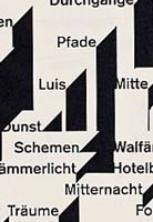
‘Both of these publications deal with the journey theme in different ways. The Lufthansa booklet is a complex timetable system made simple. This publication accurately handles complex pieces of information unhindered by cosmetic design – it is pure information design. This typographic work has been chosen for its order and function, but it is hard to ignore the absolute beauty created by the repetition of layers of type. The Stadtplan (map) book uses type as an image. The book uses abstractions to illustrate a journey. What follows is a series of typographic motifs – from the pure simplicity of justified sans serif type to typographic arrangements – creating graphic and architectural images.’
Start the discussionStart the discussion
-
Post a comment


