Pentagram gives American Express a more “cohesive” look
Abbott Miller has led the brand refresh, which sees an updated “blue box” logo that aims to work across both print and digital.

Pentagram has refreshed American Express’ identity, adapting the finance company’s “blue box” logo first introduced in 1975.
Headed up by Pentagram partner Abbott Miller, the project set out to bring greater “visual continuity” to American Express’ existing branding, says the consultancy.
American Express now has over 112 million business and consumer card customers, and 120 bank partners worldwide, according to the company. The refreshed identity needed give the brand a more “cohesive look” that would work across physical and digital touchpoints on a “global scale”, Pentagram adds.
“The challenge for the designers was strengthening a big brand for the small-space digital world, where it can be difficult to make a visual impact with detailed marks,” says Pentagram. “At the same time, the branding had to be effective in the physical world, where identities come to life in large-scale, environmental applications.”
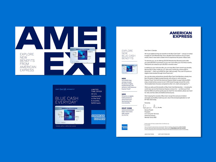
Developed in collaboration with American Express senior vice president of global brand management and design, Clayton F. Ruenensaal, the new identity sees the American Express logotype redrawn to work across applications such as smartphones and retail installations.
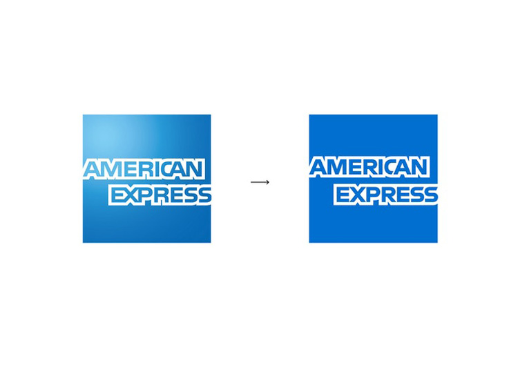
The existing “blue box” logo has been retained, which features two stacked lines of outlined lettering that sit at the centre of the blue square. The lettering has been redrawn and rendered in bold, so that the logo functions on both large and small scales.
Pentagram has also developed an alternative logo to use on platforms such as Twitter and Instagram. This version sees the larger word marque cropped to use the name “AMEX”.
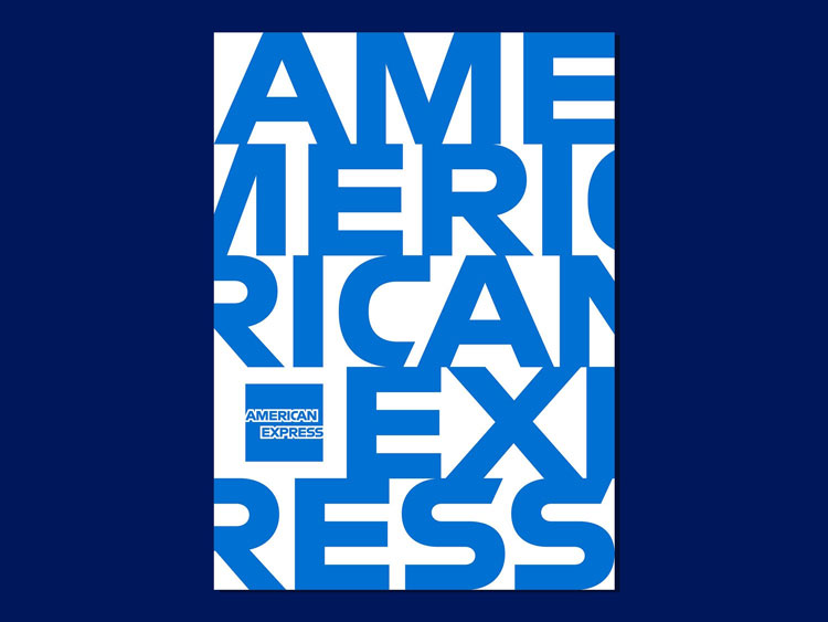
The consultancy worked with type designer Jeremy Mickel to redraw a non-outlined version of the logotype, which will be used outside of the “blue box” symbol and appears in both single-lined and stacked versions.
There is greater use of white space throughout the new identity, which looks to make the brand feel more “open” and “accessible”, says Pentagram.
The identity is rolling out across all physical and digital touchpoints.


Read this next


Sadly what you show here as a part of the new identity is very uninspiring and dull, particularly for a group as amazing as Pentagram.
Getting quite p’d off with P’s attempts at brand refreshing now. Appreciate the brief may well have been very limiting, however those ‘s’s : (
That’s it? :/
American express has such great design assets to work with; the spartan soldier, the patterns on the cards, the lovely minty green.. It was a disappointing scroll through this extremely lifeless redesign. Then again, I imagine working with the stakeholders of a bank as clients is like trying to paint The White House in rainbow colors. Tradition, conservatism, and resistance to change is a bitch.
I would have thought the card itself would have been one of the most important touch points yet both of the ones displayed here bear no link to the refreshed branding… ?
I really need to get into rebranding. I dread to think what Pentagram got paid for doing to absolute bare minimum. And what has happed to the American Express website? Ouch.