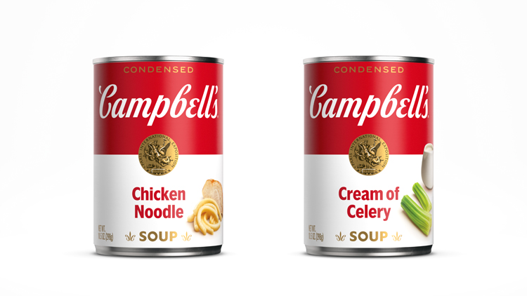
Turner Duckworth “thoughtfully contemporises” Campbell’s Soup
The work involved a dive into the brand’s past with an archivist, and features a redrawn wordmark based on founder Joseph Campbell’s original signature.
Turner Duckworth has redesigned Campbell’s Soup for the first time in 50 years, with the aim of endearing the brand to new audiences.
Founded in 1869 by Joseph A. Campbell, Campbell’s Soup has been a mainstay in kitchen cupboards for more than 150 years. It has also been an unexpected feature for popular culture, rising to fame as a muse for artist Andy Warhol.

“We were able to cherry-pick from the past 150 years”
Turner Duckworth was brought onto the project through a larger creative pitch with Publicis Groupe, according to design director Drew Stocker.
The first step in the process involved an exploration of the brand’s history with Campbell’s full-time brand archivist. “Through that experience we were able to cherry-pick from the best of the past 150 years,” says Stocker.

“More flexibility in how and where the logo can show up”
A redrawn wordmark sits at the centre of the new look. While still based on founder Campbell’s signature, the letters of the logotype have been decoupled.
The challenge here was to retain the “DNA” of the original, while contemporising it for new audiences, Stocker says. The final result, which was developed in collaboration with typographer Ian Brignell, is “less fussy”, he adds.
“Decoupling the characters in particular gives us much more flexibility in how and where the logo can show up and retain its impact,” Stocker explains.

“A moment of delight and discovery”
Extrapolated from the new logotype, updated fleur-de-lis stamps sit front and centre on packaging. The icon borrows from the C in the Campbell’s script.
Stocker describes it as “a moment of delight and discovery”, adding however that the team was “tempted to retire” the mark initially.
“It’s a generic mark and not particularly connected to the Campbell’s story,” says Stocker. “On the other hand however, it’s a critical part of the overall label experience that you miss when it’s gone.”

“Ease of navigation”
All of these changes are anchored in the “familiar architecture” of the red and white split on-pack. With a huge range of soups on offer, this was important Stocker.
“Too much of the same makes it hard to navigate, but too much difference makes for an incoherent shopping experience,” he says. “We actually made the label more consistent throughout the range than it was before — but in doing so assured ease of navigation through clear typography and the addition of carefully-shot ingredients.”
Stocker adds that “quite a lot of consumer research” proved Turner Duckworth’s theories worked in practice.

“Communicate all of the good things the brand has to say”
Beyond the packaging, the “primary vehicle for Campbell’s” Stocker explains, the team has developed a suite of supporting visual imagery for the brand to use.
This also includes a broader, food-inspired secondary colour palette, a “warm and welcoming” illustration style and a tone of voice which will help the brand “communicate all of the good things it has to say”, Stocker says.
What do you think of Campbell’s new look? Let us know in the comments below…


“Ease of navigation” it’s a tin of soup mate. Not a space rocket. ‘Av a word.
Don’t wanna be another armchair logo critic, but the ‘e’ really interrupts the flow of the type and the ‘b’ and ‘e’ begin to look numerical (for me).
I prefer the original to be honest.
Campbell’s used to be in joined up writing, now it just looks weird and disjointed. It’s lost its flow. Whilst the rest of the design hasn’t really changed. Odd?
As a “Campbell soup kid” the branding update is a welcome addition — a good idea as the cursive predecessor was probably difficult to read for a new generation — since cursive writing is no longer a compulsory school subject.