
Microsoft redesigns more than 100 of its app icons
As part of the tech giant’s drive to modernise in step with its Fluent Design principles, changes to Windows’ icons like calculator, email inbox and file explorer will soon be rolled out.
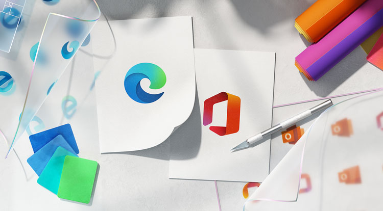
Microsoft is redesigning more than 100 of its app icons with new colours, materials and finishes. It follows a number of other icon redesigns over the past 18 months, which have included new looks for the Microsoft Office suite and Microsoft Edge.
The redesigns are part of a wider push to modernise the appearance of the software company in line with its Fluent Design principles. Microsoft notes these principles as “bringing the fundamentals of principled design, innovation in technology, and customer needs together”, while also “creating simplicity and coherence”.
Crucially, Fluent Design is undertaken on an in-house open source design platform. Different Microsoft teams throughout the world have had the opportunity to develop design guidelines and share ideas.

“Fitting in and standing out at the same time”
Notably, many of the icons will only receive subtle changes to bring them into line with a more coherent wider design. According to a blog post by Jon Friedman, corporate vice president of design and research at Microsoft, the task was to “[build] off the familiar – designing for what our customers already understand, not asking them to develop new habits.”
He adds: “The icons needed to fit in and stand out at the same time.” To achieve this, Microsoft has introduced gradient effects and a wider colour palette. It has also continued its “dynamic” ribbon motif, which can be found in the newer Office and Edge icons.
Friedman says these design decisions were made after thorough consultation with users, which revealed “flat design and muted colours” did not resonate with people, while “depth, gradations, vibrant colours and motion” did.
This can be seen in the newly adopted Windows logo itself. Previous iterations of the logo for Windows 8 and Windows 10 have been one flat colour. In this new look however, each of the four quarters has been coloured a different gradient of blue.

Growing diversity in customer need
The undertaking is also a response to Microsoft’s broadening number of platforms and services. Where the desktop was once its main touchpoint, increasingly users are accessing the company’s programmes via mobile or even VR headset, according to Friedman.
In regard to its mixed reality outputs, Friedman explains the teams had to think “beyond traditional manifestations of colours, finishes and materials.”
“We needed to consider the third dimension, so we chose new materials that reflected light and depth and felt more tactile.”
He says: “The diversity of our customers’ needs continues to grow exponentially [and] we needed our modern icon system to continuously reflect changing tides.”


Meanwhile some habits still keep on being present on our desktops. I can’t understand why the Floppy 1,5″ continues to be the save icon! Many newbie user shouldn’t not understand as floppies disappeared many years ago!
These all look really nice!
Although ‘Metro’ was what inspired the trend for flat design this decade, it is nice to see Microsoft moving on and thinking about the next 10 years.
The challenge will be getting developers to adopt these changes into their own icons. Big devs like Adobe and Autodesk adopt their own branding across software and smaller devs seem to build apps that fit in well with the OSX scheme but not Windows.
will we need icons. as buttons in the next ten years or will it be voice activated apps ?