Identica rebrands Dutch homewares brand Rohaus
The company – which has recently redesigned its product range and set its sights on the top end of the market – tasked Identica with redesigning Rohaus as a premium brand.
Identica has rebranded Dutch household appliance brand Rohaus in response to the company overhauling its product range.
Rohaus is aiming at the top end of the market with its redesigned products according to Identica which says it has looked to create a visual language that reflects “style and quality” and places an emphasis on “Dutch technology and European engineering”.
The phrase “living engineering” was coined as a guiding principal according to Identica associate creative director Tim Brennan.
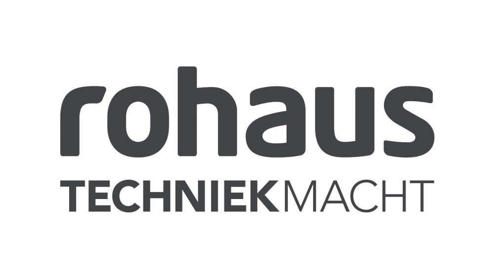
The new wordmark “has curves and ergonomic forms but doesn’t look too technological” he says.
A yellow roundel has been used to communicate “perfect balance” between the user and the product according to Brennan who says the “hot yellow” colour represents “living” and the “cool grey” represents “engineering.”
Identica has designed packaging, point of sale, product manuals and ads and the brand is beginning to roll out across European and Russian markets.


Read this next

-
Post a comment


