
“We’re on a mission to show what graphic design can do”
Can Graphic Design Save Your Life? is a new book published to accompany the exhibition currently on at London’s Wellcome Collection. We speak to co-editor Lucienne Roberts about the power of graphic design in healthcare.

Can graphic design save your life? This is the question posed by Wellcome Collection’s latest exhibition, which explores the impact of graphics and advertising on healthcare.
The show, which was conceptualised by designer Lucienne Roberts, looks at how design has been used both to help and to harm. It explores everything from classic, Swiss-style pharmaceutical packaging and hospital interiors, through to pro-smoking posters of the past, and HIV awareness campaigns.
Now, a book has been released under the same name, exploring the same topic. Roberts, creative director at studio LucienneRoberts+, is also founder of GraphicDesign&, an independent publisher that explores the impact of graphic design on other disciplines through a series of books.
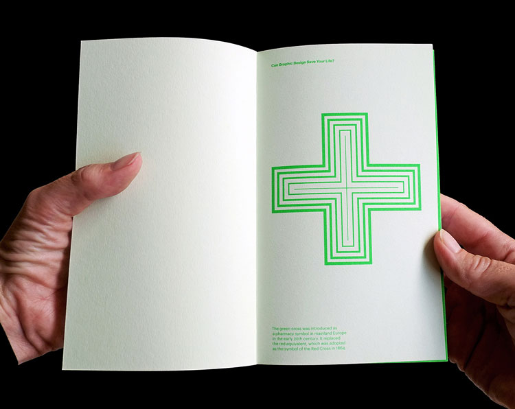
The small, A5 books all follow a similar structure. Can Graphic Design Save Your Life? features 50 different designs, devoting two pages to a short explanation of each design, the name of its original designer and an image of it. On the following page, the original designer – or somebody who knew them – answers the book title’s vast question.
We speak to Roberts about why she chose to publish this book, how graphics can be integral to the medical world, and the value titles like these can bring to a non-design audience.
Design Week: Why did you decide to publish this book, alongside putting on the exhibition?
Lucienne Roberts: GraphicDesign& came first as a publishing venture. There’s a list of subjects we’re ticking off, and health was a core one. It made sense to publish it after we put together our proposal for Wellcome Collection. Our books are building up into a little library, and we’re on a mission to show what graphics can do. The exhibition is great but it’s in London and it’ll be over soon – a book will last, and is the best way to disseminate these ideas more broadly and make sure more people see it.
The book is also much richer in terms of voices. We spoke to the different designers, some health professionals and pharmaceutical companies, and asked everyone to answer the question in the title – can graphic design save your life? It shows the way designers think, which is not something we could do in the exhibition.

DW: Who is the book aimed at?
LR: With all our books, we try to make sure they’re not full of jargon. So even if you’re not a designer, you’ll get something from it and take a different view of the design in terms of how it relates to your subject. It’s not exclusively for designers, but obviously designers will find it interesting too.
DW: What are some of the other books in your series?
LR: We’ve looked at religion, which was probably the most difficult. It showed how graphics can make something easier to understand, specifically looking at the symbolism of the nun’s habit. Another book was on literature, where we asked designers to lay out the first page of Charles Dickens’ Great Expectations. This was an exercise in typography and the variety we got back was amazing. It demonstrated how the way a text is laid out changes the way we read it.
We also did a maths book where we invited illustrators to explain the Golden Ratio, and their interpretations of a difficult concept were incredibly ingenious. Another title was an infographic book called Graphic Designers Surveyed, where we asked designers in the UK and US questions – some intrusive – about things like income and gender. This was a bit of an exposé.
DW: What topics would you like to tackle in the future?
LR: We’ve talked about covering big, tough subjects like economics and philosophy. They’re a challenge for all of us, which is what would make them so interesting. I think we’ll head in that direction next.

DW: What are your favourite healthcare designs taken from the book?
LR: One of my favourites is a book on a drug called Nobrium designed by Mervyn Kurlansky, a founding partner of Pentagram – though this book is pre-Pentagram. It was designed for pharmaceutical company Roche. It’s just quite delectable as an object, and it’s a book I’ve always wanted to have and have never found a copy, until we found one in Wellcome Collection’s library. It’s early 1970s, lush in colour and printing, and looks a bit like pop-art but also minimal.
At the other end, the Don’t Die of Ignorance advertising campaign for HIV and AIDs from the late 1980s. It’s weird saying it’s a favourite, but it’s so important for me because I remember the effect it had at the time. We met up with the designer Malcolm Gaskin and interviewed him about it for the book. The campaign was put together so quickly, in just five months, and it centred around a leaflet that went through every letterbox at the time. It was a war-time approach to campaigning.
I also love The Tobacco Atlas, a book produced for the American Cancer Society and World Lung Foundation about the effects of smoking. This has a mind-boggling number of infographics that explain how smoking affects not only health, but also the economy and environment.
Finally, there’s a book called Lighter Than My Shadow by an illustrator called Katie Green. It’s a harrowing but beautiful book, which tells the story of the illustrator’s own experiences of having eating disorders. It’s very effective and absolutely absorbing.
DW: What were the best answers to the book title’s overarching question?
LR: I love Katie Green’s answer. She explained how actually doing the book in itself saved her life. It was a personal exploration throughout which she came to terms with what had happened to her. The double meaning of her answer is very poignant.

DW: How did you curate the book and choose what went into it?
LR: There were a few historical examples that we had to include, from the likes of pharmaceutical company Geigy, Abram Games and Dick Bruna. But on the whole, the work is contemporary. We wanted to demonstrate what is happening in healthcare design now, and also be international in our reach. We included apps, illustrations, typographic projects, environmental projects, a few of which are not in the exhibition. One is a Samaritans campaign called Things on Your Mind, with illustrations by Billie Jean. It’s all about mental health and features these fabulous scribbles.
DW: How did you get in contact with the original designers, who people who knew them?
LR: It was a big job. It was just a meticulous process – we put together a list and started approaching people over email, and pretty much everybody said yes. On the whole we spoke to people over email, and gave them a word count for their answers, but some we interviewed face-to-face. A few people we already knew personally, which is always nice.

DW: How did you strike the balance between beautiful design and design that isn’t attractive but still effective?
LR: When I look at the book now, I can’t see it as pure design anymore. It’s very rich in terms of the stories, and that’s what drove it. Some historic things we like subjectively, partly because they have stood the test of time, and we feel fond of them instantly.
But then equally, something as shocking as unbranded cigarette packaging designs are meant to be horrible – the aesthetics are irrelevant. Those packets set out to make people feel uncomfortable and that’s their value. Many of the infographics are also not beautiful in a pure sense, but they’re very effective, so have a beauty of their own.
DW: How did you source all of the 50 designs?
LR: We had to get permission from the designers and from their clients, which was a massive task. Most of the work was then photographed, or we collected photos that designers had already. It was nice to have a dialogue with the clients – they were pleased to see this work reproduced because it confirmed their instinct of commissioning the work out in the first place.

DW: What are you hoping people will learn from this book?
LR: The idea underpinning all our books is to raise the profile of graphic design beyond graphic designers. Our community is quite closed, even though the work we do is not closed at all. We talk to each other about our work and why it’s important, but I don’t think we talk about it enough to the rest of the world.
This isn’t a pat-on-the-back exercise for designers – it’s just important to see how the work communicates. This particular book demonstrates how effective graphic design can be and how it can make a quantifiable difference to people’s health.
That ranges from a signage project in a hospital helping people get from A-to-B more easily, to a poster project in an Accident and Emergency (A&E) department that has reduced incidents of violence, and a project in Scotland that has increased the number of organ donors.
It’s also important to understand that design plays a part in persuading people to do things – it can play with emotions. Of course, graphics doesn’t do all of this on its own – but it’s certainly a very important factor.
Can Graphic Design Save Your Life? has been edited by Sarah Schrauwen, Lucienne Roberts and Rebecca Wright and is published by GraphicDesign&. It can be purchased for £17.50 from the publisher’s website.
The exhibition runs until 14 January 2018 at Wellcome Collection, 183 Euston Road, London NW1 2BE. Entry is free. For more info, head to Wellcome Collection’s website. Read our piece on the exhibition here.


Nice article!
I think Graphic Design Can Save Your Life!
My collegue site: https://blog.designbro.com/awesome-creative-packaging-designs/