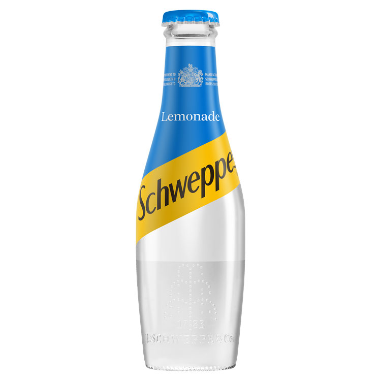
Schweppes wants to look like champagne with bottle makeover
The soft drinks brand has refreshed its logo and redesigned its bottle, taking on a new shape that aims to be reminiscent of drinking alcohol.

Soft drinks brand Schweppes has redesigned its bottle shape and branding in a bid to make it appear more “premium” and remind drinkers of champagne.
The redesign has been completed by Coca-Cola’s in-house design team alongside consultancy Kenyon Weston, and has been applied to the brand’s large plastic bottles and smaller glass bottles. The branding has also been applied to its aluminium cans.
Schweppes, which is owned by the Coca-Cola Company, launched 225 years ago with a pear or skittle-shaped bottle that was sealed with a cork. Its ranges now include mixers such as soda waters, tonics and lemonades.
The new glass bottle has been inspired by its original shape, and by the shape of a champagne bottle, says Stijn Franssen, packaging innovator for Europe, Middle East and Asia (EMEA) at Coca-Cola Company.

The branding has been simplified, with the use of a new, sans-serif logotype replacing the previous serif one, and the removal of bubble imagery.
The yellow holding device for the logo now wraps around the whole bottle, with the top half of the bottle and the bottle cap set in various colours to indicate different flavours.
A brand crest sits on the neck for all flavours, while an embossed fountain-shaped pattern sits on the base of the Schweppes Classic bottle to signify the carbonation of the drink and the brand’s “unique bite”, says Franssen.
“The new branding responds to the growing demand for premium mixers, and the skittle-shaped bottle pays homage to Schweppes’ heritage,” he says. “The new look celebrates our rich heritage with a contemporary twist.”
New bottles also contain materials that aim to keep the drinks carbonated for longer, according to Franssen.
The new look has now rolled out across all Schweppes products in the UK.


Until the labelling looks different to that of something you’d pour into an engine, the shape of the bottle won’t necessarily help sales.
The new Schweppes bottle design is a beautiful thing…..love it! And the branding is really strong too.
Looks great if you ask me!
Clean, classy and elegant. A welcome update!
Very similar to a tenpin bowling pin but love it all nevertheless. Everything looks like something after all. 🙂
Think they almost had it, I’m not a fan of the placement and typeface that labels the drink (lemonade, tonic water etc.)
It looks like it’s just been dropped on without any thought as to how it may work with the composition of the other elements on the label..
Did anyone look into the practicalities of this design (rather than the look) before launching it? The diameter of the bottle is greater than before and is not uniform along its length. As a result, the bottles take up more shelf space than previously with a lot of wasted space between them – not a desirable quality as far as a retailer is concerned!
As a consumer of around 6 bottles a week, I usually purchase these, ten bottles at a time. I find it handy to store them in my wine rack in my garage. Not any more! THE BOTTLES ARE TOO BIG TO FIT IN !!! I have also previously stacked them in a kitchen cupboard, on their side, laid on top of one another. NOT ANYMORE, THE BOTTLES JUST WOBBLE AROUND AND FALL OUT OF THE CUPBOARD!!
OK the bottle may look pretty, if you buy 1 a week and stand it up, but for retailers (and myself) I feel that this design is a retrograde step. I am interested in the taste of the contents – the prettiness of the bottle is a small side issue to me!
Back to sampling Asda/Sainsbury/Tesco/Morrisons own brands methinks – this bottle design is a big negative for me!
Style over substance.
Bottles cannot now be stacked horizontally.
At the self-checkouts, I grab the neck of the bottle and drag it over the scanner. Doesn’t work, the barcode is covered by my hand.
If it isn’t broke, don’t fix it.
As a shareholder, it’s frustrating that money is being spent on unnecessary retooling.
Looking at the comments above, it’s a classic case of lack of testing. There are so many instances where I come across this – design that clearly hasn’t been lived with. Send out 6 bottles to 100 randoms, ask them to live with them as they usually would over the period of a week report back their problems then alter accordingly. I can guarantee that these issues would all come to light plus a few more. So simple. Too simple to be excusable.
Agree with the sentiments of style over function, which is not just limited to this bottle design. Our fridge has a bottle rack that hangs under a shelf. I used to place one bottle of Ginger Ale in it with ease. The new design is awful as it pushes the bottles in the adjacent locations out of place. Worse is the fact that the cap now point downwards making it difficult to grab off the shelf. As a marketing exercise, it has backfired as far as I am concerned, as I will now be looking to buy from another manufacturer when I have finished the current bottles.