Dull design… but I don’t believe it’s free design
Sitting in my local café, I peeled the plastic from my new Design Week hoping as I usually do, to see some great design inspiration.
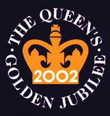
Sitting in my local café, I peeled the plastic from my new Design Week hoping as I usually do, to see some great design inspiration. I reached page 15 (Letters, DW 12 July) and saw The Queens Golden Jubilee 2002 logo.
My first reaction, like most reactions from DW readers, was disappointment. Not just because the logo devalues its subject, but because I was reluctant to read what I thought might be a complimentary article surrounding it. I was relieved to learn it was to the contrary. Thank you Mark Elgar.
Come on Nicholas Jenkins Design, paid or not, you have some wonderful work in your portfolio Don’t let this stain it.
Then on page 27, another Royal logo of The Queen’s Award For Enterprise 2000 (pictured, right). Admittedly, more developed than some, but it gave me the idea (not that original really) that some sort of standardisation of the crown logo is needed in order to maintain a good and consistent image when together with host events.
Jeremy Aston
Art director, Simpli Design
jaston@simplidesign.com
Read this next

-
Post a comment


