Revision on
There are many pitfalls in trying to evolve a design which is already acknowledged as a classic, sometimes it’s better just to leave well alone.
Spare a thought for the designers of the New VW Beetle, Anglepoise lamp or Fritz Hansen chair. Whether a car, a light or a seat, updating a classic is one of the most fraught assignments in product design.
The update can suffer in comparison with the original icon because user appreciation and admiration is earned over decades, not weeks. The popularity of the classic can get lost in contemporary translation because the real nature of consumer appeal is like mercury – it can slip through your fingers. And the updated version can look out of place in its new social or technological context because, well, lightning rarely strikes twice and the factors that made the product so successful in the first place might not reassert themselves in quite the same way.
Despite this, some product designers spend much of their lives updating classics. Changes in manufacturing technology, market trends and consumer needs are all reasons why a classic design eventually outlives its usefulness and designers try vainly to pour its essence into a new bottle, as the marketing department watches nervously from the sidelines.
In those cultures, including our own, that are so driven by the rhythm of product obsolescence, few mourn the passing of a classic – even if we are capable of forming a sentimental attachment to those things which really work well over time. The Anglepoise is a good example; its basic design principle has been unchanged since 1934, although in its newest incarnation – the Anglepoise IT 2000, launched this autumn – this classic light now addresses Seasonal Affective Disorder, one of the most topical trends of the contemporary workplace.
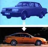
However, other cultures, most notably the Scandinavian countries, have put their modern classics on a pedestal to the extent that best-sellers for more than 40 years become very difficult to change or upgrade. Swedish cars, for example, have enjoyed such a distinctive character since the Fifties that making Volvo cars or Saab saloons more European in style in the interests of broader sales has been viewed as traumatic. In the case of Volvo, whose appeal rested for a long time on the functionality of its box-like shape, it has taken an outsider, English design director Peter Horbery, to effect radical change.
Horbery once spoke at a British Design and Art Direction conference and compared his role as Volvo’s head of design to the tourism director for Sarajevo (the Balkans war was raging at the time). Both were irrelevant, he implied. The iconic status of the Volvo could not be tampered with. But Horbery has introduced a new generation of sporty Volvo coupés that break decisively with boxy tradition, while remaining recognisably part of the Volvo family. Horbery claims it is all in a careful redrawing of the lines of the cars. “Volvo is essentially Swedish and it’s my job to maintain that,” he says.
Others are emphatic that he has managed to walk a tightrope without falling off. According to leading motoring journalist Quentin Willson, “Volvo has taken a quantum leap from a car that looked like it had been styled using a set square with bits of angle iron, to a new look that is passionate, curvilinear and volumetric. It has invigorated Volvo’s image overnight.”
A similar transition has been taking place within the Saab design studio at the Trollhattan manufacturing plant near Gothenburg, where Saab designers have been taking a famous marque in new directions. Saab is synonymous with its aircraft origins – back in 1948, aircraft engineers from Svenska Aeroplan AB (Saab for short) worked to turn a distinctively shaped prototype designed by Sixten Sason into a production model. This was the Saab 92, front wheel drive and available only in green, which lasted well into the Fifties and set the tenor for successive quintessentially Swedish models.
For more than 40 years, Saab’s clay modellers and stylists took their cue from the fighter plane analogy, but new computer-aided design processes, new international markets and new ownership (as part of General Motors) introduced the need for change. In recent years, Joel Danielsson, manager of design and car concept in the Saab Design Centre, and chief designer Einar Hareide have worked together closely on the development of the Saab 9-5 and 9-3 models, which have updated a design classic.
Danielsson is a keen student of Saab’s design history and is determined that the past should not overshadow the future. “A distinctive brand character is important to Saab,” he explains. “We’re very aware of the fighter plane analogy and that imagery is always right at the start of our design process. But we can’t be insular. We’ve also got to take an international view and measure ourselves against world best practice.” Saab interior design manager Aamer Mahmud adds: “The old Saab interiors had simplicity, quality and a character that was very Scandinavian. Today, we need to add emotion to car interiors – not just more technology or more wood trim. How we use new materials inside the car will be very significant.”
The challenges facing Saab are mirrored in other Scandinavian industries. Kinnarps is Sweden’s largest manufacturer of office furniture and the sixth largest in Europe. This family-owned firm employs more than 1300 people worldwide, yet, incredibly, its commercial success has been based on a furniture system first designed and manufactured in 1952 and hardly updated since the Sixties. The enduring functionality of this simple modern Swedish range has made it hard to upgrade.
But after several false starts, Kinnarps finally bit the bullet and introduced an entirely new range called Series E at Workplace 99 in London this autumn. E stands for environment, economy, e-commerce, and the like. Managing director Henry Jarlsson, son of the founder of Kinnarps, explains that growing calls for flexibility in offices forced the company’s hand. Series E is certainly more flexible than its predecessor. Its modular storage, wide range of table shapes, colours and finishes, and special leg configuration which allows the user to slide the leg into any position along an under-desk frame system, creates versatile scenarios for the different ways people will want to work in the future.
However, the look and feel of the range remains essentially sparse and uncomplicated. Kinnarps takes its name from the Swedish village where it is now the largest employer. For UK-based design manager Ingemar Johannson, who worked closely with consultant designer Kenneth Osterlin on the project, it was tough to develop a totally new range in just 18 months to supplant a system which has been successful for more than 40 years. “Everyone is looking over your shoulder. You’ve got to be sure you’re making the right decisions,” he explains. “All the different variants have to fit together to make a convincing whole.”
Johannson is relieved at the outcome – a departure, yes, but one which is recognisably within the company’s product tradition. Other Swedish furniture companies update classics with more alacrity – Ikea, for instance, thinks nothing of taking a Bruno Matthson armchair, for example, and creating a low-cost self-assembly version which gives you the icon without the expense (provided all the parts are included in the flat pack).
However, some products, such as Arne Jacobsen’s famous 1953 Ant Chair for Danish manufacturer Fritz Hansen, defy modernisation. Not even a designer of the calibre of Vico Magistretti, himself a creator of many furniture classics, could overshadow Jacobsen’s original when asked by Fritz Hansen to design a new laminated wooden chair in recent times. Year after year, Jacobsen’s original still works its magic. As it speeds towards its 50th birthday, it shows no signs of age.
The same cannot be said of Jacobsen’s interiors. The guest bedrooms of his 1959 SAS Royal Hotel opposite Tivoli Gardens in Copenhagen demanded a contemporary makeover despite being among the most sacred icons of Scandinavian modernism. Designer Yasmine Mahmoudieh did not shirk this sensitive task: her scheme pays homage to Jacobsen and the golden years of Danish design after World War II in its forms and materials, but is inescapably of today. The “kidney” shape made popular by Jacobsen and his peers in the Fifties manifests itself in lighting fixtures in a curved wooden wall behind the bed, in oval-shaped colour contrasts in the carpeting, and in sandblasted glass elements in the cabinet-mirror. The palette of materials is also typically Danish: maple wood, coloured glass, aluminium and local fabrics.
Of course, even classic hotel interiors need to move with the times. But for other Scandinavian objects, it is a case of “if it ain’t broke, don’t fix it”. Another Jacobsen, a Norwegian called Jac Jacobsen, saw the Anglepoise in 1937 and, through a patent loophole, popularised it internationally through his company Luxo. Luxo lights today are Scandinavian classics in their own right, which may be unfair, but that’s the way it works.
Raymond Loewy, most definitely not a Swede, once famously wrote an autobiography called Never Leave Well Enough Alone. Loewy was always tampering with design classics, from the Lucky Strike pack to the Studebakker car and the Coke bottle. But for others less confident than New York’s super showman, updating the classic remains a tough one.
Read this next

-
Post a comment


