Volvo branding gains extra Bite in bid for consistency
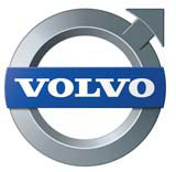
Volvo Car Corporation is making one of its most significant branding changes in 75 years, as it drops its primary logotype identity in favour of a redrawn version of its car badge.
Under consultation with branding and communications group Bite, Volvo’s global brand guardian, the Ford-owned company is elevating its ‘iron symbol’ to become the single visual identity across all print and marketing materials, as well as new car models. Bite has also redrawn the symbol, reconstructing the previous 3D identity as a 2D vector graphic that is softer and more curved, with a matt silver hue.
‘The company decided about two and a half years ago to consolidate its branding, after we realised that there were lots of slightly different logos,’ says Bite creative partner Keith Crook. ‘The application of the marque, rather than the design changes, is the major change here, although it was a complicated process to create such a complex vector graphic.’
Volvo’s For Life tag line, which was used with the previous text-only marque, will be retained under the new brand architecture, but becomes a separate element, to be used where appropriate, according to Crook.
Although AB Volvo, the Sweden-based arm of Volvo, which includes the truck, aerospace and technology divisions, was not acquired by Ford when it bought Volvo Car Corporation in 1999, it has also been involved in the brand architecture process.
AB Volvo will retain the Volvo word-marque at the corporate level, but is adopting the updated iron symbol for a number of its other operations.
Read this next

-
Post a comment


