Profile: Suzanne Sykes

Suzanne Sykes is an influential force in graphic design after winning awards for Grazia. She tells Hannah Booth how she has combined the qualities of artistic and mainstream magazines to succeed in a saturated market
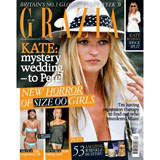
The downside of being an award-winning art director is that you’re in demand. Suzanne Sykes (pictured), founding art director of the already iconic and bestselling weekly, Grazia – who recently added two awards to her D&AD Yellow Pencil earlier this year – has just returned from New York, where she was asked to give a presentation on the differences between US and British magazine design.
‘I hate standing up in front of an audience,’ she says, jokingly. ‘ I don’t do much industry stuff, but, because the design [of Grazia] is catching people’s eyes, I’m increasingly being asked to.’
As it turned out, the New York forum, organised by John Brown Publishing creative director Jeremy Leslie, was rather enlightening. ‘We’re braver over here, we can get away with more. There’s less of a gap between commercial and arty magazines.’ The marriage of these two elements, Sykes believes, is Grazia’s winning formula: it strives to be upmarket, with high visual standards and design techniques, but it’s also mass-market.
‘The original Grazia – the weekly Italian magazine – is dry and wordy, but visually superb. We thought, can we keep that high design [standard], yet include celebrities for the UK market? Our answer was, if we had the money and the staff, then why not? The public’s view of magazines is tainted. Why can’t a weekly consumer magazine be well designed?
The cut-and-paste, ‘ad hoc’ aesthetic is key to Grazia’s look. Sykes works in layers, starting with, say, a deep red, covering it with a layer of white, then black. She then peels away chunks for a headline or picture caption, revealing the original layer underneath. She uses bite-sized chunks of text, and she’s not afraid of black. ‘Reverse-out type on black… works really well on our matt black paper. The paper stock makes the magazine feel more newsy, which is vital… [so] readers think of it as a fast-moving magazine that they should buy every week.’ The cover stock is 170gsm Woodfree – UPM Finesse, and text stock is 65gsm UPM Ultra Silk. A matt extender is added to provide the finish required, as with the Italian edition. Grazia now owns the colour yellow – as Heat owns red – and it is used for all its important opening pages. But there are ‘up to eight’ other colours on the palette per issue.
The magazine’s use of photography is radical – it doesn’t seek to humiliate its subjects. ‘I structure every page around the photographs. We try not to be derogatory. If it’s an emotional story and calls for a more expressive photograph, I’ll use one where [the subject] looks beautiful and tragic, not rough. Otherwise, we generally use photographs that make people look glamorous and iconic,’ she says.
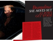
The same rule applies to the ‘real-life’ stories – ‘We don’t differentiate between subject matter,’ she adds. She often uses full-width photographs where other magazines would crop in, ‘because they can be very revealing’. One example showed Paris Hilton posing in front of a bank of paparazzi: ‘That shot put her in context.’ The covers are full bleed, ‘rather than using lots of square photographs’, to complete the layering effect.
Grazia has pioneered the use of tilted headlines, captions and standfirsts, ‘which add pace’, Sykes explains. ‘But you have to use it sparingly, and only with high-end visuals, otherwise it [looks] cheap.’ Grazia uses a mix of fonts: Raleigh, Garamond 3, Gill bold and light, Helvetica and Vag rounded bold.
Sykes is a magazine designer to her core. After training as a graphic designer, she launched Marie Claire with its editor Glenda Bailey in 1988 (the pair met on quarterly fashion magazine Folio); she founded her own company, Gloss Creative Partnership, where she worked on contract publications, including Abbey National; she also launched the Daily Mirror’s ‘M’ magazine under Piers Morgan. She worked on the dummy of Grazia for a year ‘on and off’ before its launch two years ago.
Such is the success of the UK’s design that the Italian version has taken on many of its graphic devices. And it’s been winning awards: if Sykes was delighted with the Yellow Pencil – ‘It was not expected, they usually give them to arty magazines,’ she explains – the two Press Gazette Magazine Design Awards, for Best Designed Features Pages and Magazine Icon of the Year, were equally welcome.
But not everyone’s impressed. MDA judge, designer Adrian Shaughnessy, says Grazia has got so much press because it’s commercially successful, not because it’s ground-breaking in its design. ‘Publishers love it, but I find it oddly old-fashioned and dated. I think it’s a missed opportunity to have been even more radical.’
Some, however, would argue that Grazia’s success is because of its design. But Sykes isn’t telling. ‘The great thing about designing magazines is that it’s not taken quite as seriously as some aspects of design,’ she says. ‘It’s not with you for years, like a book. If you make a mistake, there’s always next week.’
-
Post a comment


