The campaign trail
Oliver Bennett votes on the Suffragettes’ branding and marketing abilities, as an exhibition celebrating the movement’s founding opens
It doesn’t denigrate their cause to see the Suffragettes as an early phenomenon in the great era of marketing. Almost 100 years ago, when Emmeline Pankhurst and her daughters formed the Women’s Social and Political Union, they established a meaningful colour code of purple, green and white – standing, respectively for dignity, hope and purity – and applied it across all kinds of publicity media and materials.
Moreover, they had great copywriters. Take this great piece of persuasion, from a 1913 poster: ‘What a woman may be, and yet not get the vote: mayor, nurse, mother, doctor or teacher, factory hand. What a man may have been and not lose the vote: convict, lunatic, proprietor of white slaves, unfit for service, drunkard’. And the Suffragettes had a vast repertoire of visual media by which to sell the cause of women’s votes: handkerchiefs, embroidered aprons, badges, sandwich board-type frocks – even guerilla actions, such as the fatal Derby Day intervention in which the most extreme Suffragette, Emily Davison, tried to grab the bridle of the King’s horse. They could have taught today’s viral marketers a trick or two.
The breadth and quality of their publicity achievement can be seen in the exhibition Art for Votes Sake at The Women’s Library in London’s Whitechapel, whose own corporate colours, as seen on its letterhead, maintain the Suffragette colours. ‘The Suffragettes were great communicators and made great, bold images,’ says a spokeswoman for the library. ‘Their graphic styles were highly fashionable, and reflected the trends and styles of the day.’ As a social marketing phenomenon, the Suffragettes were a highly effective team, helped by the presence of several artists among them, including Sylvia Pankhurst and Arts and Crafts artist Ernestine Mills.
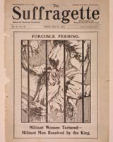
The media and artforms they chose were primarily graphic and illustrative: for instance, the political cartoon. Pages from the house magazine left you in no doubt, via illustrative licence, of the tortures of force-feeding (1914 cover pictured).
Elsewhere, they used the form of the narrative ‘history’ painting, such as the 1910 image by the artist Bertha Newcombe of the 1866 scene in which Emily Davies and Elizabeth Garrett present the first suffrage petition to John Stuart Mill. In this sense, they were a link between Victorian pomp and the new era of mass media. Some of their media platforms were taken from the female-centred traditions of church and union, the embroidered banner being pre-eminent – and here, the main banner designer, Mary Lowndes, showed a noble graphic sensibility commensurate with her job as a stained glass artist.
Elsewhere, the Suffragettes used simple, agit-prop woodblock posters, pre-figuring the ‘primitive’ hand-drawn typography of art groups such as Germany’s Die Brucke, on which would be written punchy messages. Some had curlicued foliage reminiscent of the Arts and Crafts Movement and Art Nouveau – attractive and loaded with import.
Yes, but was the campaign successful? Well, 15 years later women over the age of 30 achieved the vote and this was extended to all women over 21 in 1928, causing the exhibition to be celebrating another anniversary – the 75th anniversary of the Equal Franchise Act. By today’s standards that would be considered slow, but this was making history, rather than sales.
Art for Votes’ Sake: Visual Culture and the Women’s Suffrage Campaign is at The Women’s Library, London Metropolitan University, Old Castle Street, London E1
Read this next

-
Post a comment


