Sweeping the board
Photography in annual reports is improving, but the directors’ shots could be better
Once annual reports were a straightforward way of communicating the solid, corporate reliability of a company. This usually meant a graphically-simple recipe of a mission statement, a group of middle-aged “suits” staring from page three as if frozen in the headlights of their new-found fame – a particular shot that has become irreverently known as the “butcher’s shop window” – followed by page upon page of crucial but turgid tables.
More often than not the suits are still there; as is the statement and the tabulated facts and figures: these are, after all, staple requirements of the genre. But there are a few changes going on, like a more creative blend of photography and graphics. And even the uninspiring board shots seem to be treated with more thought.
This increasingly informal graphic approach may even be a harbinger of change in corporate culture. Bamber Forsyth creative director Lee Hoddy has noticed “a strong trend towards realism, and no frills photography”, which has partly emerged, he thinks, “because of the need for corporate openness”.
Bamber Forsyth has designed reports for Whitbread, Blue Circle and BAA, and has helped to introduce a “reportage” style. “Both clients and the design industry now feel that photography could work harder in annual reports,” says Hoddy. “After all, it is such a good communicative tool, and a great way to tell stories.”
In one report for Provident Financial, for instance, the chief executive was shown meeting a real customer in a real-life situation. In another, for Whitbread, photographs were taken of people enjoying themselves and Whitbread’s brands, taken to illustrate that the brewer has diversified into leisure. This report, says Hoddy, aimed to “provide a snapshot of Britain today” – an aim which would have seemed irrelevant and grandiose ten years ago.
Since the deregulation of the Eighties, and the growth of the “shareholding democracy”, annual reports have to talk to a larger group of people. “Ten years ago annual reports were primarily talking to investors and they had a very corporate tone,” says Williams & Phoa managing director Kia Boon. “Now management has become aware that their reports have to show that they understand their customers,” he says. To this end, he says, annual reports tend to use more consumer-friendly imagery. “For instance, breweries which would have once been very dry and corporate now know that they have to show that they appreciate leisure and fun.”
Like any piece of published work, annual reports have to try harder to get people to look at them. “They have to be more competitive, which is one of the reasons why their use of photography is becoming more interesting,” says Boon. “There are very few outstanding ones, but because of the high production values, there are also very few bad ones. And with access to retouching technology now office- rather than bureau-based, it is possible to use stock photographs in an illustrative way.”
Williams & Phoa has produced two or three annual reports just using photolibrary pictures, including one for a shipping company. It had no pictures of the board (“too shy”, says Boon) and they didn’t want to use pictures of ships, so it used sea creatures instead, scanned in and manipulated on page to produce an expressive graphic effect. The consultancy also designed the report for Getty Images, using the huge photolibrary’s own stock.
Andrea Thompson, managing director of Eye II Eye, which has recently designed reports for the Home Office and the London Processing Centre, has also noticed this change. “Annual reports used to be very staid,” she says. “Thankfully, they are losing that dryness. They are now very much led by their design, as they have to be visually competitive.”
Photographer David Partner, who has shot several annual reports over the last few years for clients including Railtrack, The National Grid, Airtours and Laing, reckons that the last five or so years has seen a tendency towards “more innovative use of photography, and a much greater collaboration between photographers and designers”.
“The annual report seems to have evolved from a basic A4 page-plus-picture format to a more sophisticated, even conceptual, use of pictures and words,” he says. “This is partly as a result of a much closer collaboration between designer and photographer. While the plcs for whom the reports are made still tend to be conservative by nature, they are becoming much bolder in the use of graphics and photography.”
Boon believes that this greater graphic effort is taking place as part of a sea-change in the corporate world. “They are trying to show that they understand their consumer base. They want to communicate their brand values, rather than their assets, and the report has to get a better response from the consumer.”
One of the thorniest photographic problems with annual reports remains how to make the board members shots look interesting. As the role of the report evolves, this much-neglected element is full of, as yet, untapped potential. “It is a way of putting their business into the context of real life,” says Hoddy at Bamber Forsyth. “Shareholders want to know more about the business these days and the report has to work harder and for a broader audience. A couple of photographs of executives sitting in ivory towers do not match the expectations of the modern consumer and shareholder.”
“Unless it’s some young computer company, management does not tend to be up for innovative pictures,” says Partner, adding that most board members simply want the photography to be quick, painless and efficient. “You’ve got to butter them up a bit,” he says. “They turn up on the day and while you expect them to be reasonably smart, that is not always the case. Always pack a clothes brush.”
Most are publicity conscious, he says, and it is always the uncooperative ones who look grim on the page. But Partner warns against over use of the reportage style. “I have seen ones that look staged and contrived,” he says.
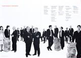
Eye II Eye has managed to take the traditional board-room photograph to new limits. In a recent report for LPC, the board members are seen in line, striding along in suits in a reference to the film poster for Reservoir Dogs – albeit in a friendly way that interprets the film’s tagline – “Let’s go to work” – as a corporate clarion call. In another LPC report the board is seen around a table, in similar “action” style, with the word “forward'” on top of the image. And in neither of these photographs is there a caption identifying the board members by name. It is a visual message.
However, Boon at Williams & Phoa hasn’t noticed a “sea change” in the style of board photography, although he agrees: “The mug shots have gone, and the pictures are more animated.”
Photographer Lee Funnell has worked on annual reports for clients such as Flextech, Tibbett and Britten, Siebe and Laporte, by way of design groups including Fishburn Hedges, Sea and Addison. She believes that the key to the modern report is a friendlier informality.
“Design consultancies are persuading management to do something more informal,” Funnell explains. “I often take photos of staff in meetings looking more relaxed, and though the normal portraiture style still holds sway, if you take a little time with the location, the results can be much better.”
Most of the board members see it as a necessity and therefore do not mind. “You very rarely get anyone saying, ‘let’s do it like this’,” says Funnell. “Most simply care about how long it is going to take.” The management types acknowledge the growing importance of the annual report, but they rarely make demands on the photographer during the shoot. No doubt the photographers prefer it that way.
-
Post a comment


