999 brands challenger company Spark Energy
999 has created a new identity for independent power company Spark Energy, which is aiming to challenge the ‘Big Six’ energy suppliers in the UK.
The Selkirk-based company is rebranding after signing a deal with Morgan Stanley that means it can now buy direct from wholesale markets.
999 says it aimed to create a new identity to reflect Spark’s new status ‘as a big player’.
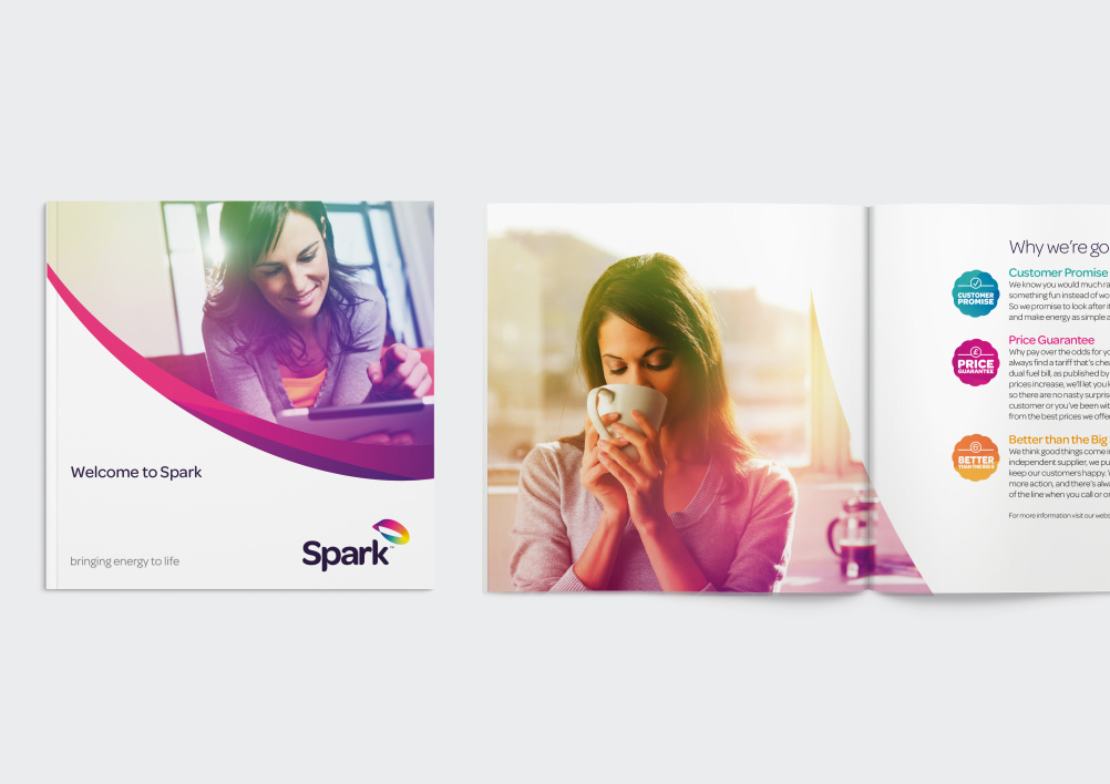
The logo features an ‘energy loop’ that the consultancy says represents ‘a never-ending vitality that touches all aspects of life’. The tagline ‘Bringing Energy to Life’ has also been introduced.
999 has created designs for all touchpoints, including website, welcome packs and bills, as well as graphics at the Spark headquarters.
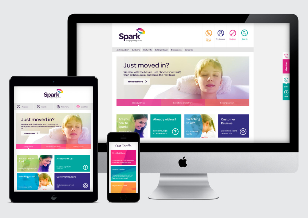
Bill Gaughan, creative director at 999, says, ‘We have joined up the customer experience of Spark Energy: from their explorations online to the receipt of their welcome pack and follow-up communications, right the way to the way the HQ looks.’
Read this next


Playful yet generic San Serif Font… Check.
Use of a Ribbon Marque which shows Perspective… Check.
Use of a Full Colour Gradient within Marque… Check.
Compare against British Gas Logo… Check.
Check against Current Logo Trends 2013… Check, Check, Check, Check, Check.
Err…
http://www.ageuk.org.uk
Come on Mark – it’s completely different eh? The mark is clearly on the left on ageuk and there is an upper case S on Spark! Even the website – whistles. Much too close imo.
Guys, shouldn’t this be a place for a more serious analysis of design work? Frankly it’s easy to put down ANY design with facile comments. Any design. A brand isn’t summed up by a logo alone, it’s also about tone of voice, image treatment right through to the choice of channels for engagement to make up a living/responsive brand identity. Let’s move beyond judgements which could have been made decades ago, we’ve moved on. And readers (and the design community) deserve more respect, unless you’d be happy sharing your own work to be shredded (which is inevitably easy so long as substance and thought are avoided – as you’ve clearly shown). Can we raise the bar with comments throughout Design Week please, fed up of such inane commentary from people who really should know better. As for my views on the branding work, I’ll come back to this forum when I’ve seen more – how a brand is brought to life and how it rolls out in reality is usually far from as abstract as a few images here make it seem.