Asian Subconscious
Singapore-based arts design studio Kult has put together a selection of posters by ten contemporary graphic designers from the country, all based on the theme Asian Subconscious.
The designs take on a wide range of influences, including Asian architecture, packaging and food, though some take on a straightforwardly typographic-based approach.
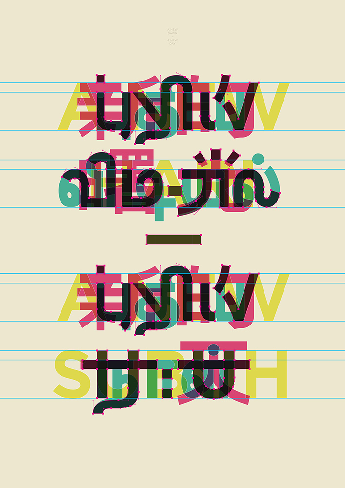
Designer Where Are You Going (see top of the story), for instance, takes elements from three existing alphabets, overlaying them in bright colours.
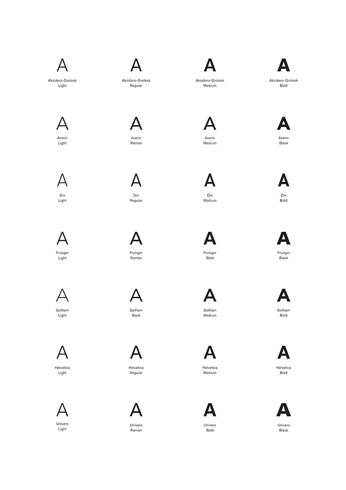
Anonymous, meanwhile, strips things right back to a single letter – ‘A’ – which he says is ‘for Asian.’ He explains, ‘One of the most common misconceptions formed of Asians is that we all look the same. [My poster] draws parallels between [this idea] and another common misconception – that all sans serif typefaces look the same’.
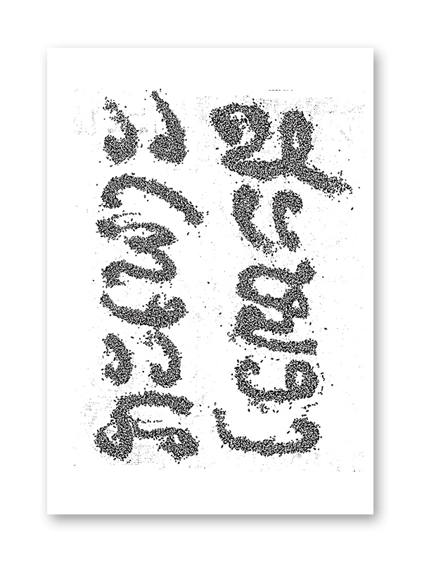
Drawing on the Asian love of food, LSD has created his piece using black sticky rice to spell out ‘brain’ and ‘stomach’:
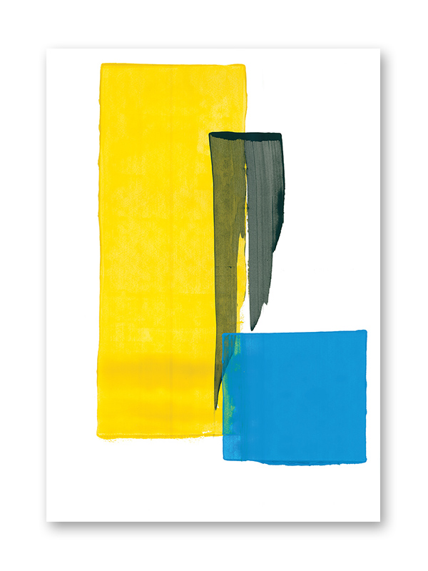
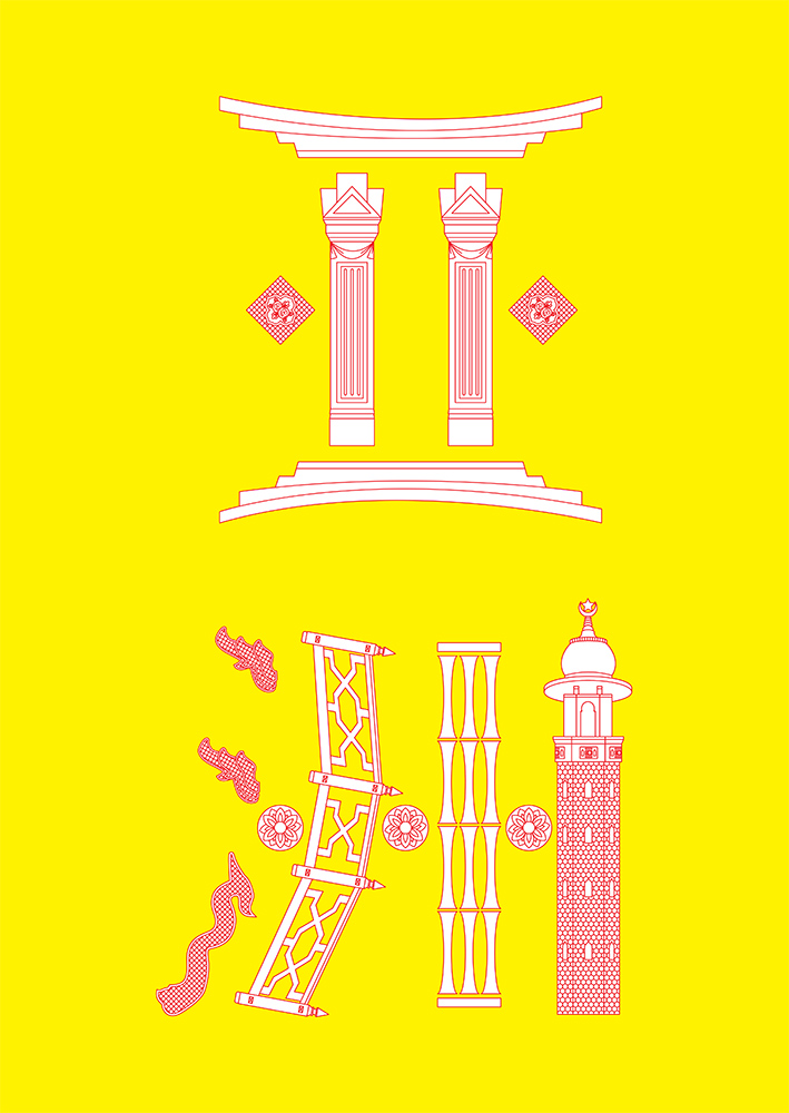
Ryan Len’s influences are more straightforward in this lovely yellow, red and white print; creating typography from different elements of Asian architecture:
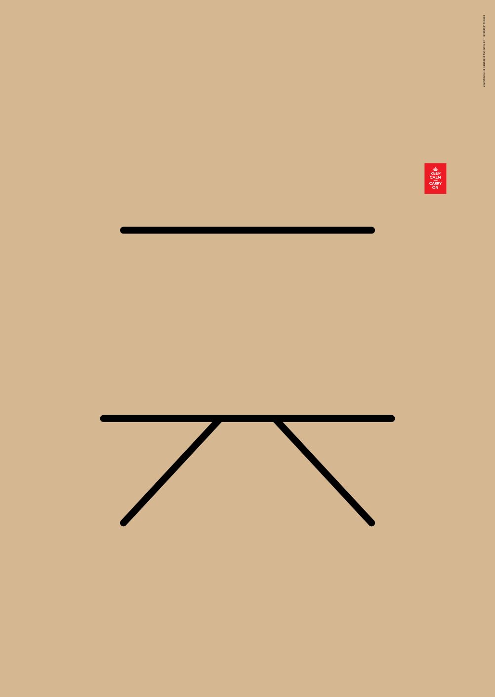
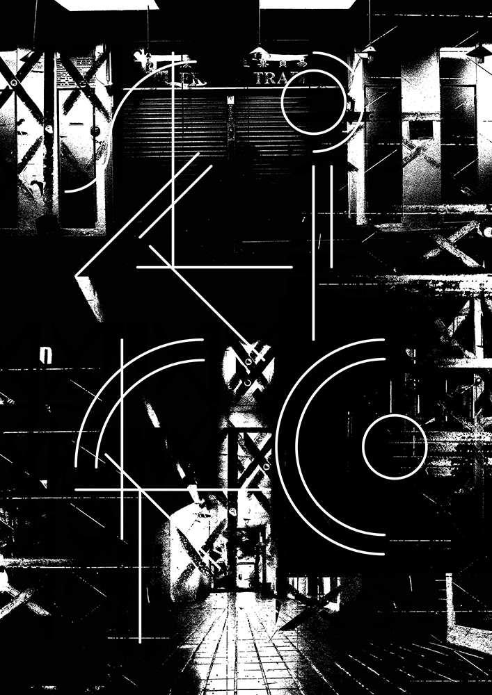
We love the sinister feel of Bloodthrone’s poster, which looks to industry and trade to create a piece which, he says, refers to the view of trade before accelerated urban development – when it was something ‘filled with laughs and tears that remind us how fragile we are as humans:
The series was brought together to mark the collaboration between design brand Kapol and new furniture and product collection Industry+. You can buy them from the Kult website http://www.kult.com.sg/home/
Read this next

-
Post a comment


