Indiegogo rebrands with flexible identity system
Push Offices has rebranded crowd funding platform Indiegogo which has unveiled a new look website and an identity system that frames a different image each time the website visitor refreshes or revisits their page.
A redesigned optimised website features ‘rich integration of photography, video and success stories’ according to Indiegogo, which hopes its revised brand and website will better engage both campaigners and funders.

Eric Boisvert, managing partner of Los Angeles-based Push Offices says, ‘The new Indiegogo logo and identity system are fluid, evolving and dynamic. And this is a radical departure from both traditional identity systems and fixed logos of dominant global brands.’
The consultancy says it spoke to stakeholders before creating the adaptable logo which honours the ‘openness and democratisation’ of the platform by placing the Indiegogo community at the centre of the mark.
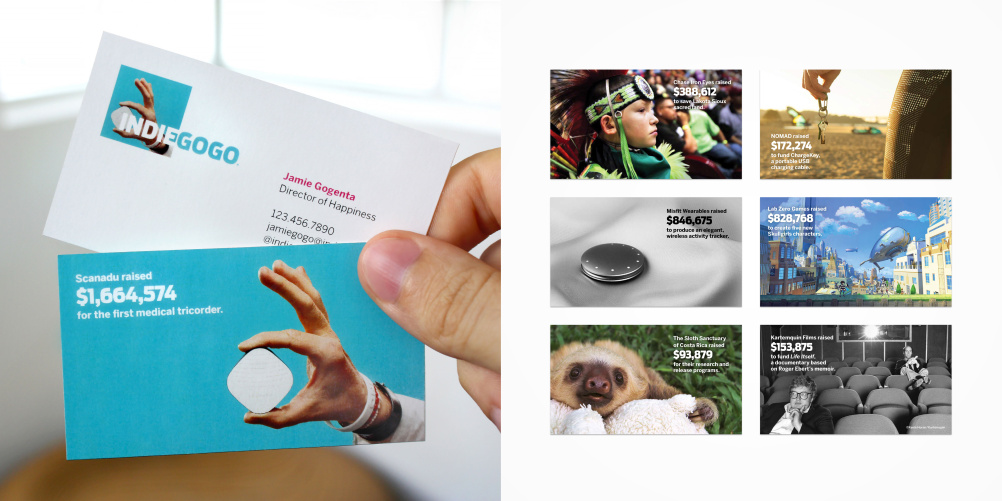
Boisvert says that business cards have been designed as ‘pocket-sized case studies for successful campaigns, which when flipped over happen to have employee contact information on them. Every new employee gets a stack – almost like crowdfunding trading cards, each with a different mini-case study on the back.’
Push Offices looked for a brand colour which could differentiate Indiegogo from its competitors and came up with a magenta colour ‘which we call GOgenta’ say Boisvert.
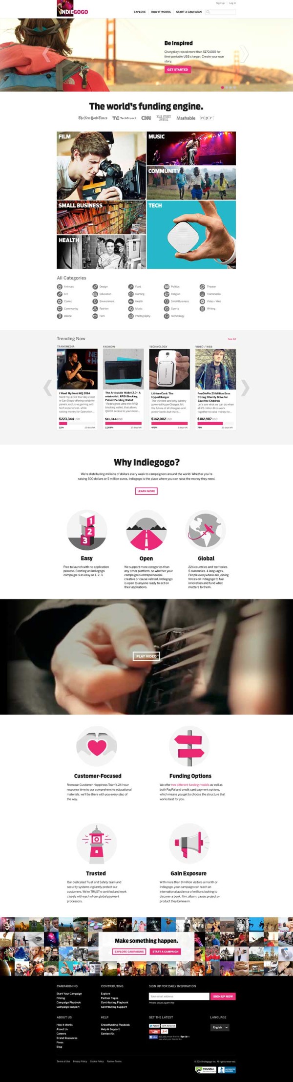
For the website, also designed by the consultancy, functionality has been improved so that ‘funders’ can find campaigns more easily, navigation has been improved, and new ‘education tools’ have been integrated, such as the ‘indiegogo playbook’ which replaces the Learn Centre and the ‘indiegogo blog’ which gives tips on creating successful campaigns.
Indiegogo, which was founded in 2008, claims to be the world’s largest crowd funding platform and is headquartered in San Francisco with offices in New York and Los Angeles.
Read this next


Had a look at the website – the frame refresh highlight you pointed out doesn’t work properly…
…but then neither does the identity!
I agree.
They’ve created a logo using a frame & colour palette then pretty much abandoned those elements to use photography; which has a totally different look & feel.
The core imagery showcased is uninspiring and in most cases fights with the logotype.
The relationship between those core elements are completely lost with the photography comes across as a short term campaign piece rather than an identity.