We Make Design rebrands youth charity
Irish consultancy We Make Design has created a new identity for London-based charity New Horizon Youth Centre.
NHYC is a day centre that works with young people who are vulnerable, homeless or at risk.
Dublin-based We Make Design was originally appointed around a month ago to look at the charity’s collateral because of a connection with one of the directors, according to the creative design consultant Nik Dillon.
Dillon says We Make Design then suggested that this was a good opportunity to look at the organisation’s identity.
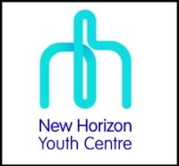
She says, ‘We wanted to create a friendly identity that suggests a simple journey of A to B – where they currently are today and where they would like to be tomorrow.’ Dillon describes the unbroken line in the logo as being like a ‘pathway’.
Journalist Jon Snow, who is chairman of the charity, says ‘[The new logo is] clear, crisp, vibrant and all-embracing, and says what we wanted it to say about the work we do – creating positive futures for young people.’
The new identity will roll out on printed materials and a website that is due to launch next month.


That logo looks like the ‘middle finger’… might just be me though
I THINK TOO…….I DON’T KNOW WHY
I THINK TOO…….I DON’T KNOW WHY
Think it is just you ‘Anonymous’ … personally I think it’s right on the button for this type of organisation.
No… there’s definitely something a little lewd about it. I can’t say “middle finger” was my first thought, but I definitely see it. Honestly, my first impression was a little ruder than that, even…