Art directors choice
My last blog post discussed the impact of minimal design in the realm of self-promotional material sent out by illustrators and designers alike. Having observed an influx of striking one-colour (and namely black) projects of late, this week I’d like to concentrate on the use of minimal colour palettes in design and show you a few of my favourites.
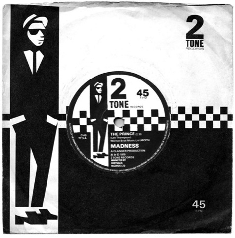
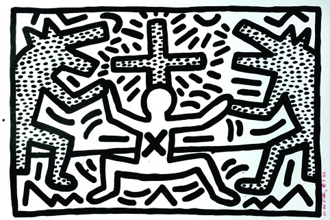
Historically, black and white has been used in all manner of applications. From MC Esher’s Op Art, the iconic Jerry Dammers-directed chequered Two Tone record sleeves, the Guinness advertising campaigns and Keith Haring’s murals, one-colour has been used expressively to create something that, in my opinion, full colour couldn’t achieve.
The English Farming and Food Partnerships identity, created by Purpose, is a particularly strong example of the effectiveness of using a single colour. The bold use of largescale type and imagery, infographics and grid structure creates a retro, but contemporary, highly graphic aesthetic.
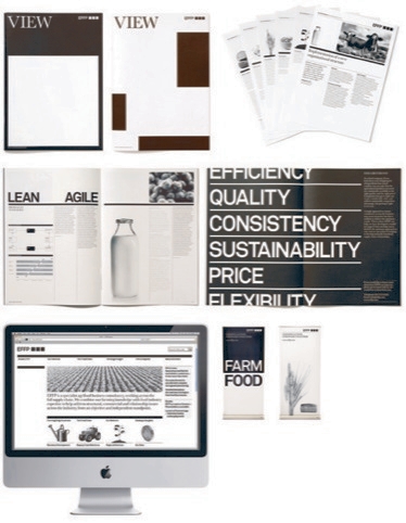
‘In a sector where images of rolling green hills, the odd free range chicken and the latest Massey-Ferguson bring opportunity, to go completely black and white felt like a step back to a bygone era,’ says Stuart Youngs, creative director at Purpose. ‘However, the militant use of a single colour has helped EFFP grow through the economic crisis and no longer require financial support from the Government – all because they get noticed first.’
This winning formula resulted in two Design Week Awards this year, in the Identity Programmes and Editorial Design categories. It rolled out across all of EFFP’s marketing collateral, the website and View, its large-scale newspaper.

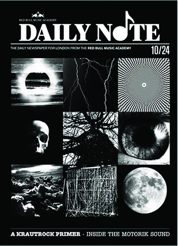
One designer whose work I’ve always admired, Trevor Jackson, is also a champion of black-and-white design. From earlier music industry artwork created for Bite It! Recordings, the black-and-white optical illusion album artwork created for Soulwax in 2004, numerous releases on his own imprint Output Recordings and recent work for the free Daily Note newspaper, one-colour has become synonymous with Jackson’s work. Interestingly, however, his choice of minimal colour palette is dictated by his colour-blindness.
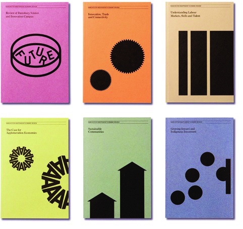
Finally, Manchester-based Music created a series of six, one-colour reports for the Manchester Independent Economic Review. The design was kept simple and elegant, produced on a variety of coloured sugar paper, with a strong use of vector illustration used to create impact. Again, the success of this work netted Music a win in the Print Design category at this year’s Design Week Awards.
In the creative studio, many identity briefs will dictate that a logo should translate to black and white, so there’s also the argument that if a design or logo doesn’t work in a monochrome format then it hasn’t achieved it’s full potential.
So why is one-colour so impactful? Is it that our senses are heightened through a lack of colour or is it that the eye absorbs monochrome imagery quicker? The absence of colour in design means that everything has to work harder – whether it be an emphasis on bold typography or striking high contrast image use. Perhaps the message becomes more direct and easier to digest, void of colour to sell it. Whatever, the reason, it seems a timeless choice that will always have a place in design.
I’d be interested to hear your opinions and any links to examples of striking one-colour work would also be welcome.
Read this next


Some nice examples of monochrome style self promotional items.
http://www.flickr.com/photos/selfmadeheroes/4399009125/#