Ringside seats
If you fancy a ringside seat at some design fisticuffs, you should watch yesterday’s Newsnight. In the blue corner, David McCandless, journalist, graphic designer and author of blog and book Information is Beautiful, defended his assertion that presenting information in a beautiful way can bring clarity and focus – quality graphics can increase the likelihood that you retain information.
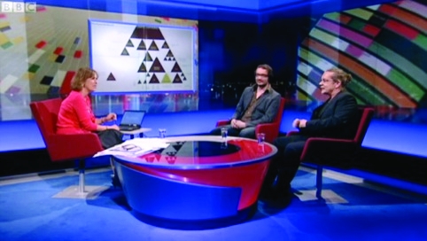
Source: BBC iPlayer
Newsnight
In the red corner, graphic design heavyweight Neville Brody rained the punches on such ‘beguiling’ infographics. ‘The problem is, trying to make information pretty can sometimes hide the core message,’ he said. ‘So that you end up with something which is very beguiling and seductive but [which means] we’re often missing the core message – that there is a story [made out of these pieces of information] which is extremely relevant to our daily lives.’
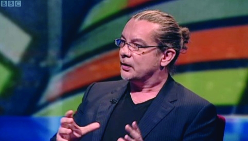
Source: BBC iPlayer
Neville Brody, graphic designer
In fact McCandless was pretty much knocked out in the first round. ‘I’m striving to create a landscape out of these images so that you can explore [the information],’ his defence went. ‘Colour, space, shape [are] the language of the eye, and words and numbers are the language of the mind, and if you combine the two you’re speaking two languages and become more powerful.’
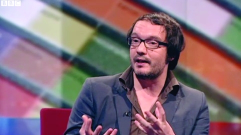
Source: BBC iPlayer
David McCandless, journalist, graphic designer and author
That somewhat meek parry didn’t do much to convince, but some of McCandless’ work does the convincing more eloquently. Granted, a representation of the meaning of different colours in different cultures (as popped up at an inopportune moment during the discussion) might amount to what presenter Kirsty Wark called ‘coffee table graphics’ but his interpretation of the projected billions spent on the Iraq war is exactly the sort of visual that can help readers grasp the enormity of the costs involved.
With an endless flood of data and stats coursing through the Internet and other media, infographics are becoming invaluable.
As Alex Morrison, managing director of Cogapp, said in Design Week last month, ‘We’re entering a new world where events, locations and contextual information are open and shared, and it’s going to be huge. Visualisation is the sexy graphics output of that, but the challenge will be in designing information architecture which makes sense of it and allows people to do something useful with it.’
If this information architecture happens to be sexy or seductive, even better – after all, beauty and brains is a winning combination.
Read this next


hmmm.sorry I missed the heavy punches. But what did Neville Brody actually say other than being a bit contrary. Seems to me that McCandless was trying to put over, with his graphical approach, the core message by distilling the essence from a plethora of information.
I found this exchange infuriating. Is Brody seriously arguing that presenting information in an attractive, easy-to-understand format is a bad thing? He repeatedly stated that it didn’t have enough content (clearly untrue) and that while the graphics were beguiling, they didn’t engage politically. I couldn’t disagree more.
The Iraq War cost example is a perfect instance of information design as a weapon against the obfuscatory presentation of data our governments use to conceal the truth. I particularly love the detail of the projected cost of the war at the outset (tiny square, bottom right) compared to its eventual outcome.
Most infuriating of all, neither Wark nor McCandless challenged him to spell out what an alternative, grassroots, politically engaged information design might look like.
I’m guessing David was maybe a bit shocked to be sitting there getting slated on live television by a designer that most of our generation look up to, but even so, if I was in his shoes I’d have defended my integrity a bit more, especially when presented with such a straw man argument.
I’m afraid that film brought me close to banging my head on the desk, mainly because I found myself nearly agreeing with Neville Brody. A lot of the examples shown are illustrations of an area that use the ‘infographic treatment’ as art: dare I say ‘infoart’.
Infographics have traditionally been used to make either large amounts of, or particularly complex information easier to understand. I think it would be hard to argue that infoart makes anything simpler – just more likely to be looked at and admired.
Words like ‘pretty’ and ‘beautiful’ are very subjective and were used unfairly in a negative manner by Brody.
It’s tempting to criticise a piece or body of work if it doesn’t happen to conform to one’s own design ethos …sadly too tempting for Neville Brody to resist.
It’s about explaining and engaging the viewer …communicating the core information, demystifying and bringing clarity. Difficult against today’s chaotic information onslaught.
If we are indeed living in a generic age, we surely don’t want generic design.
Brody’s key point seems to be that infographics hide the core message. This seems a pretty flimsy argument.
Infographics grab attention, people spend time with them, investigate to them, and in so doing their attention is drawn to a message that they might otherwise not have engaged with.
I agree with Adrian Berry that Brody was just being contrary, and I quite liked the fact that McCandless was respectful and didn’t get into the sort of classic ‘put up fight’ that these sorts of situations try to bring about.