News analysis – hand-drawn branding
When Music delivered the design of Chester Zoo’s new brand (alphabet pictured), it opted for a hand-drawn approach, by illustrator Adam Hayes, to ensure maximum flexibility – in this case to appeal to families and to promote conservation messages.
Hand-drawn or handwritten type can provide consultancies with a nuanced reply to a client brief – as well as a bespoke solution.
Chris Harrison, founder of Brighton-based consultancy Harrison and Co has taken the handwritten approach on several identity projects.
Harrison says that for a recent project to rebrand Visit Brighton ‘any font we tried to put to it didn’t ring true and felt like someone else’s identity’.
Harrison says he sees Visit Brighton – like Brighton itself – as ‘independent, free-thinking, free-spirited and creative,’ and so wrote the brand it in pen and ink.
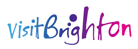
An online version of the brand, Love Brighton, followed and this time Harrison worked with illustrator Carol Kemp.
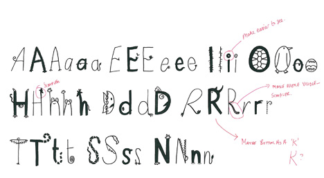
Kemp, who has worked with the likes of Coley Porter Bell, Design Bridge and JDO on identities, is keen to differentiate between the handwritten and hand-drawn.
She says, ‘With the handwritten it’s the stroke which creates the form of the letter and with the hand-drawn it’s about outlining and building up the letter form.’
When creating a complete font Kemp designs ‘alternate versions of letters to create the real feel of handwriting,’ if for example there are two ‘I’s’ in one brand name.
Although the designs, says Kemp, are crafted in the first instance with ‘a pen, brush, crayon, cotton bud… I don’t want to give away too many trade secrets’,they still need to be scanned-in, retouched and vectored.
Kemp is also asked to draw whole fonts and has recently completed work for Brandopus’ designs for Rowse Honey as a supporting font for pack descriptors and general use on the brand’s website – and for the same consultancy, a complete font for baby food brand Plum Baby.
Creating entire fonts provides is an insurance which can be delivered with guidelines to be used for any future design developments, ensuring the client can take ownership of its brand, without coming back to the consultancy.
Read this next

-
Post a comment


